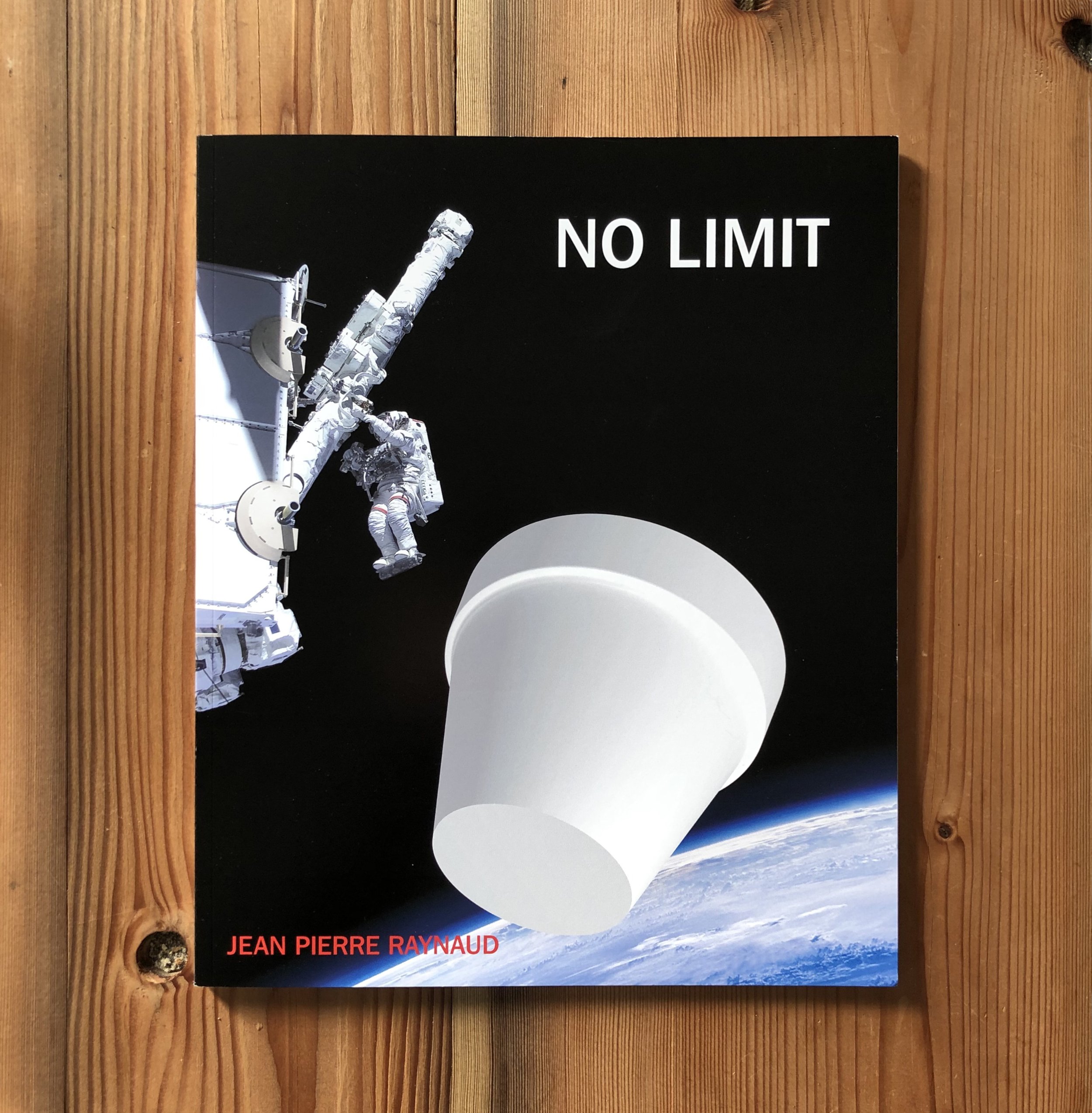
Exhibition Catalog, printed at GHP, West Haven CT. Digital Offset, Konica Minolta, AccurioJet KM-1, 2022. 52 pages. Typeface: Franklin Gothic. Client: Josee Steinberg & G, Litte Sky.
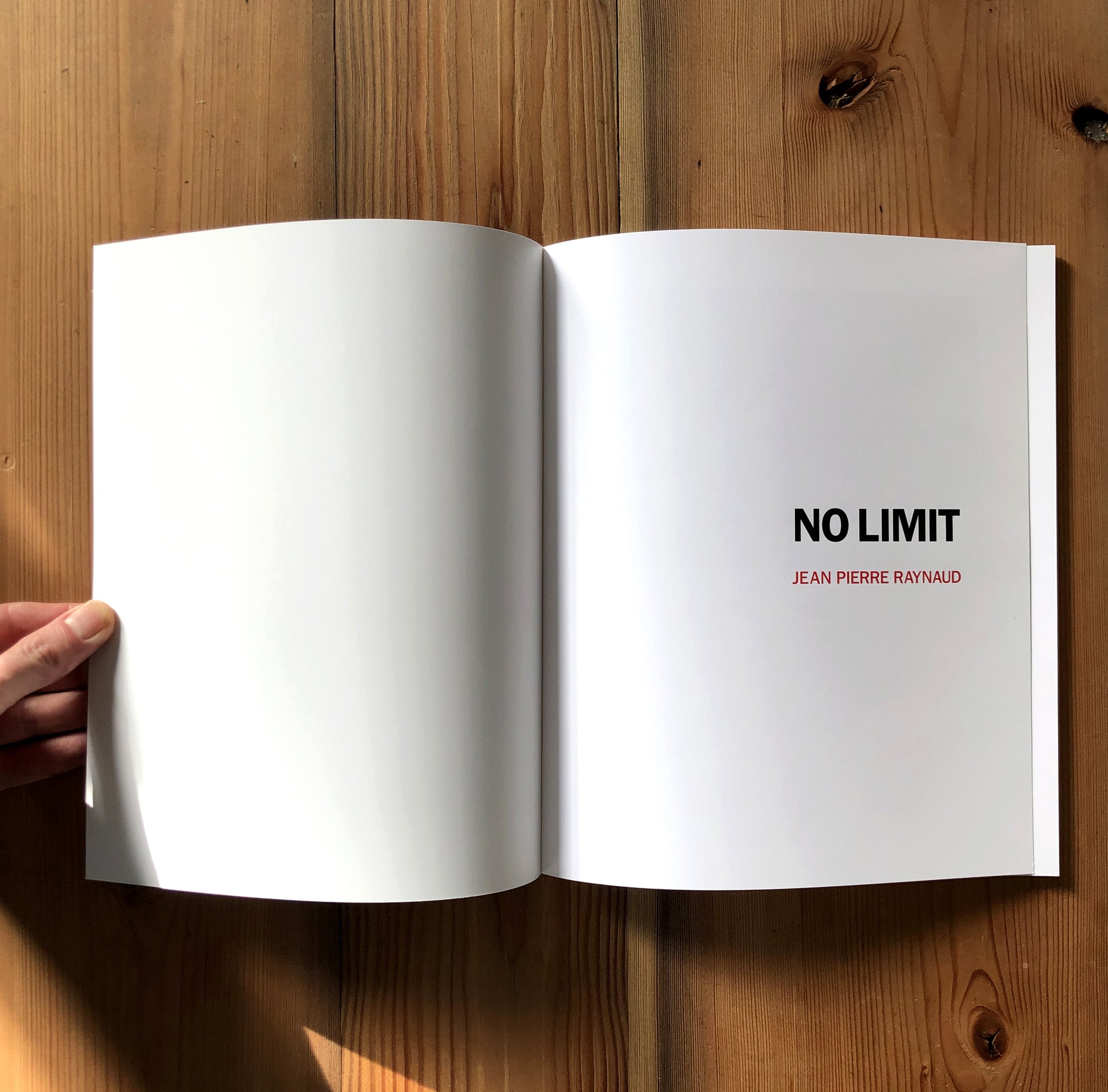
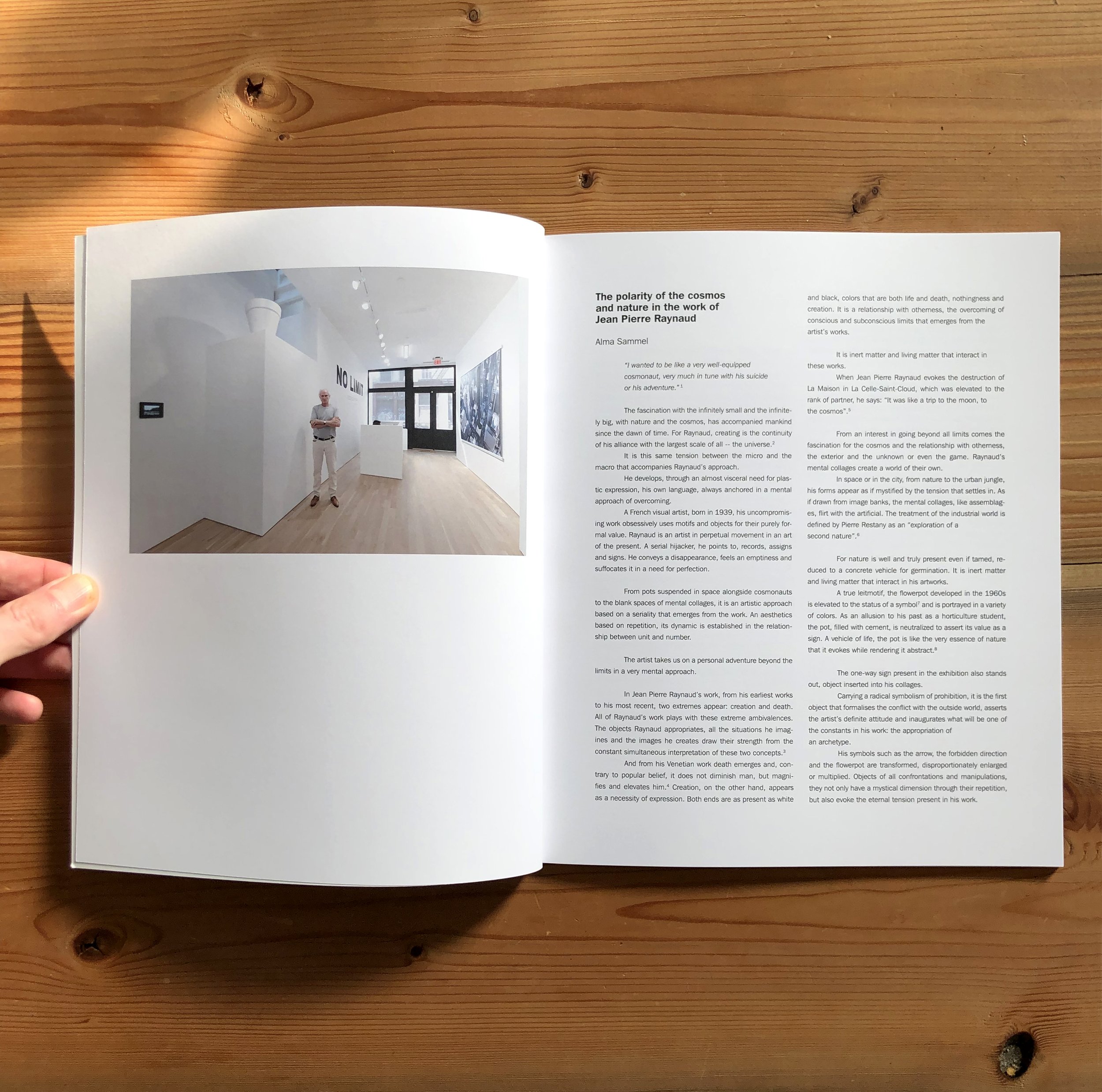
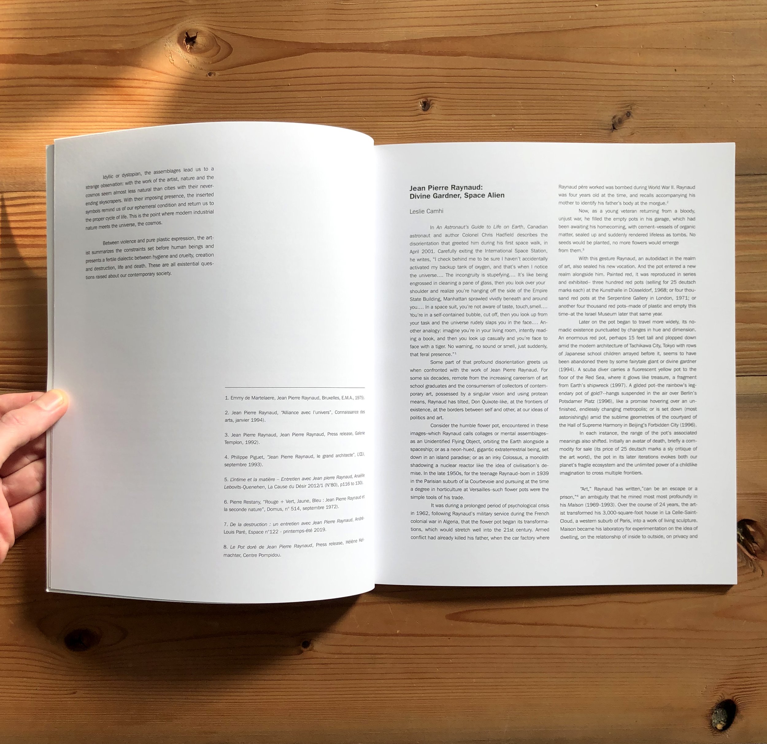
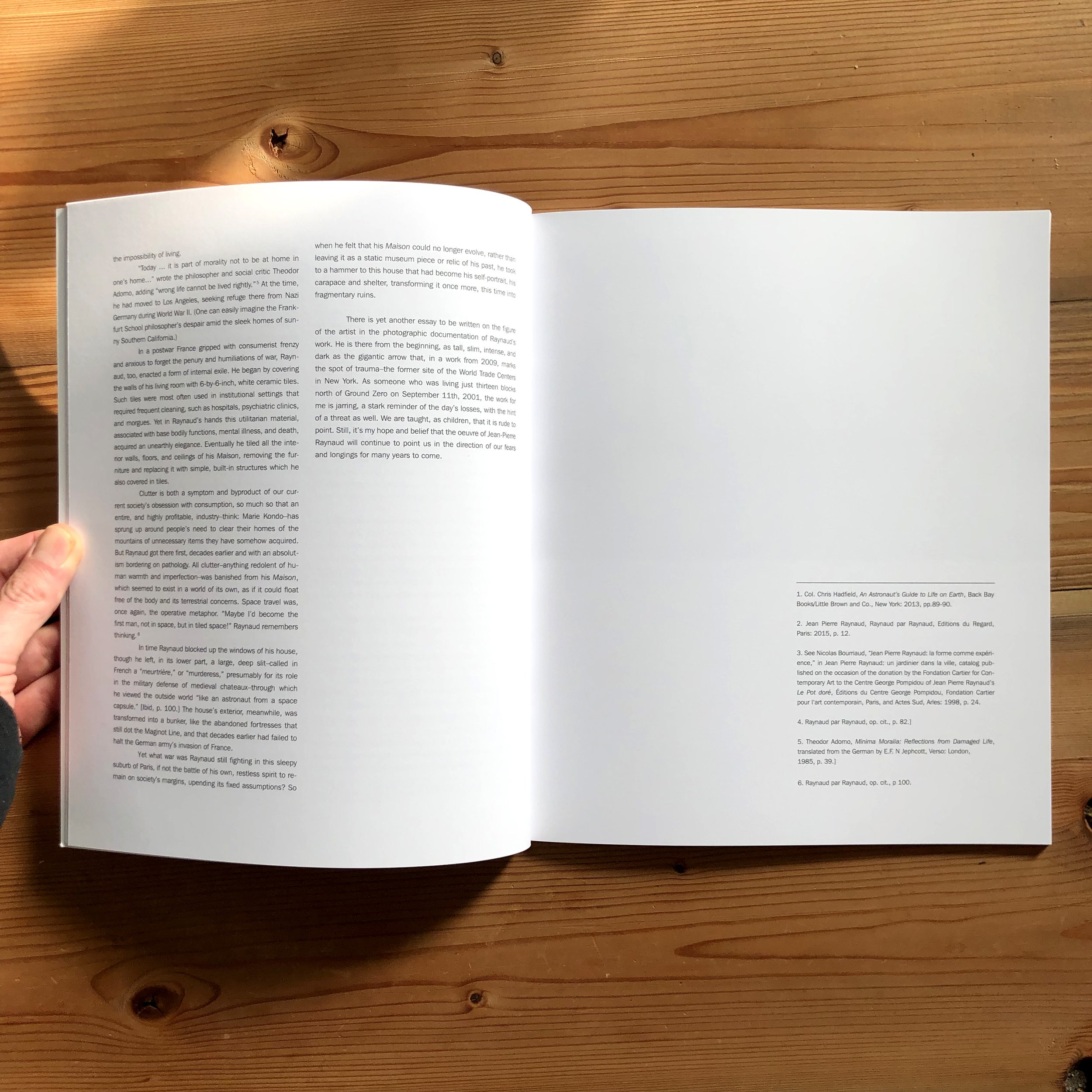
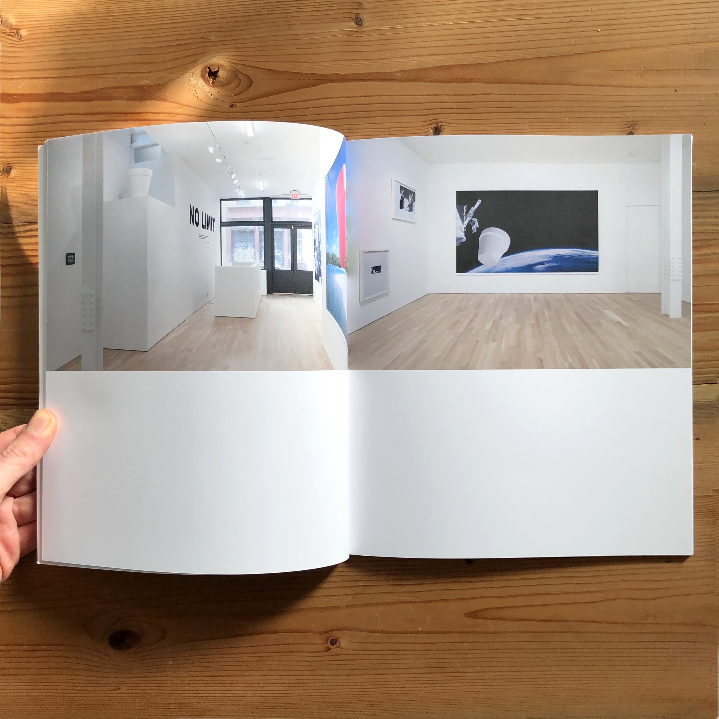
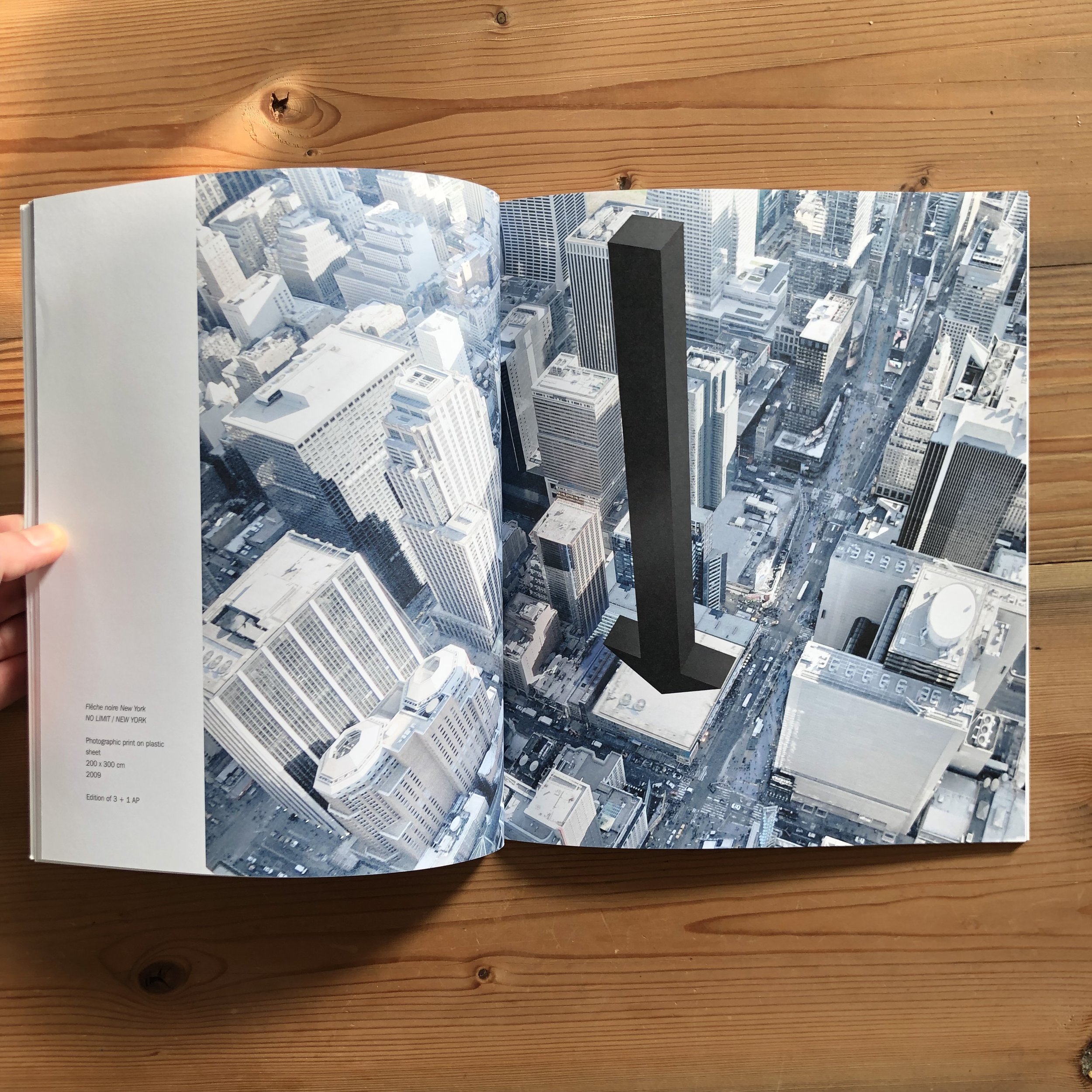
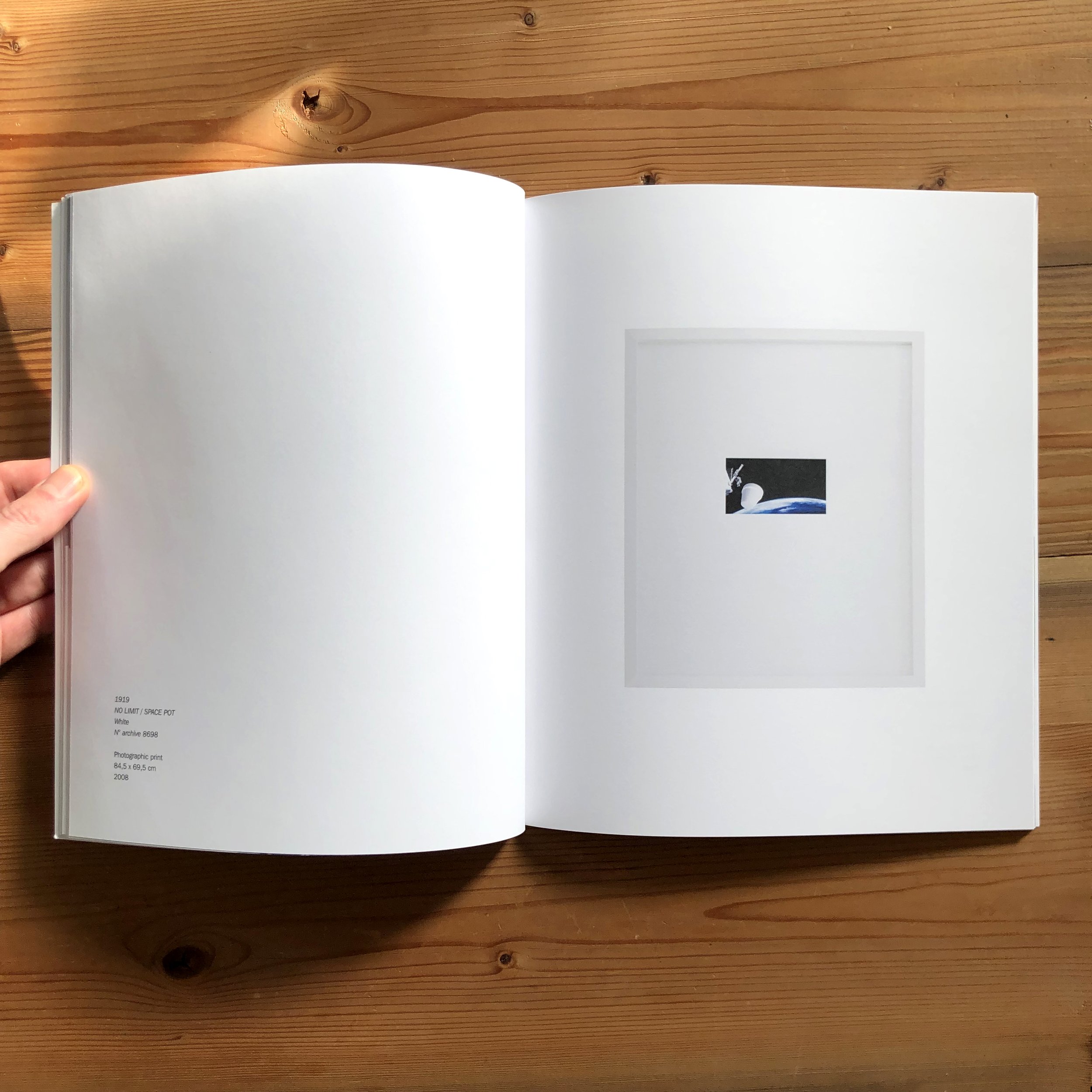
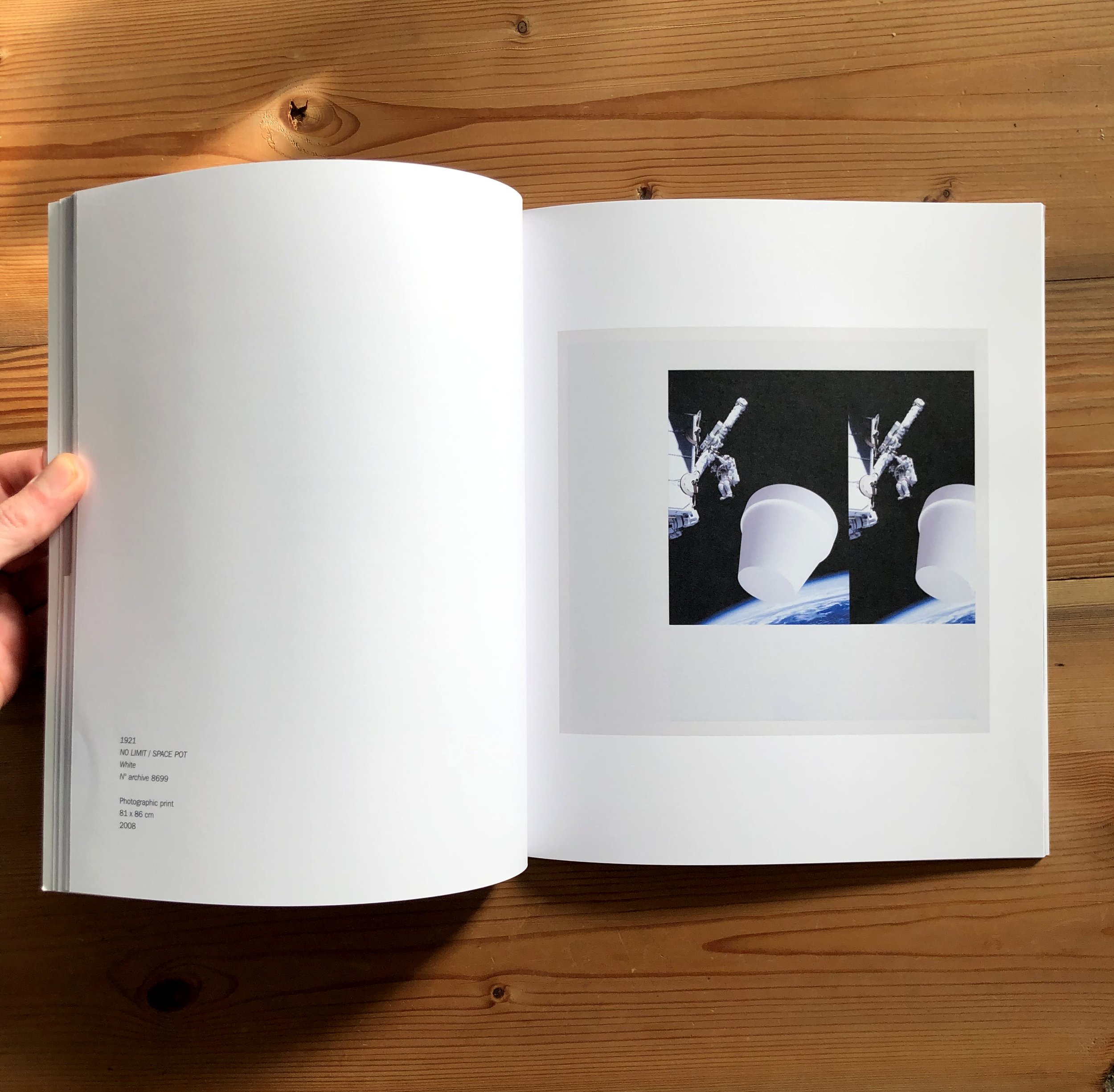
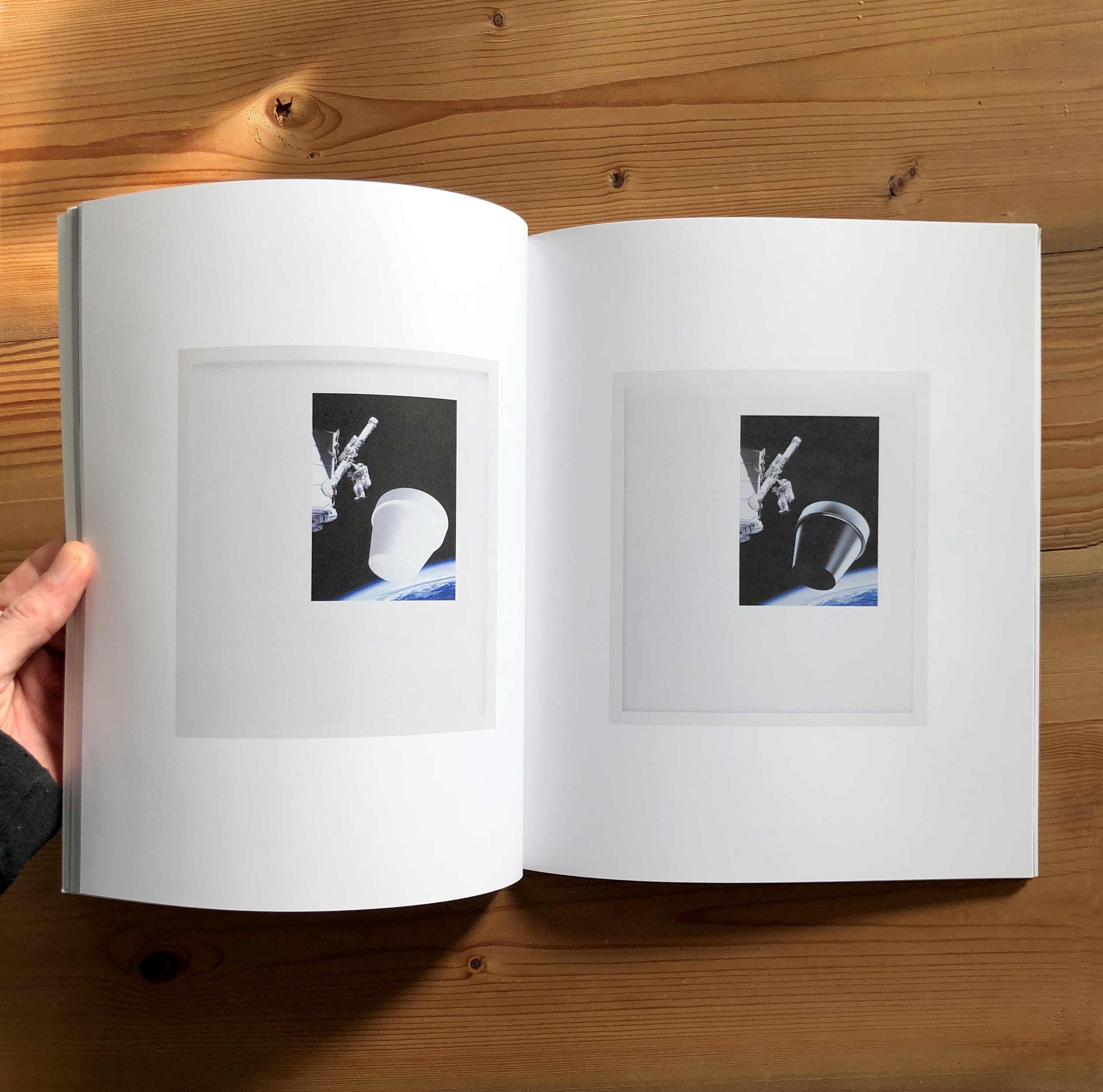
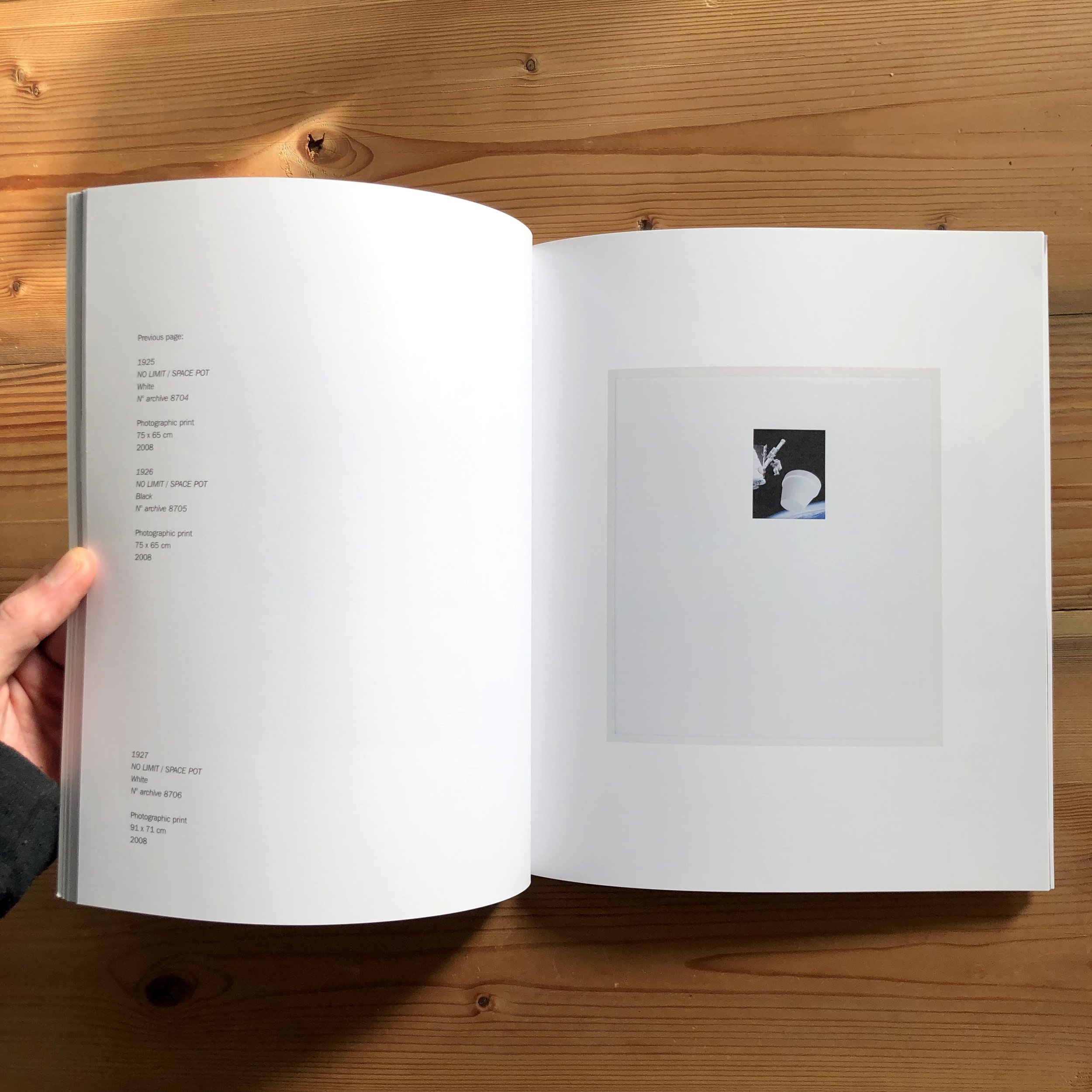
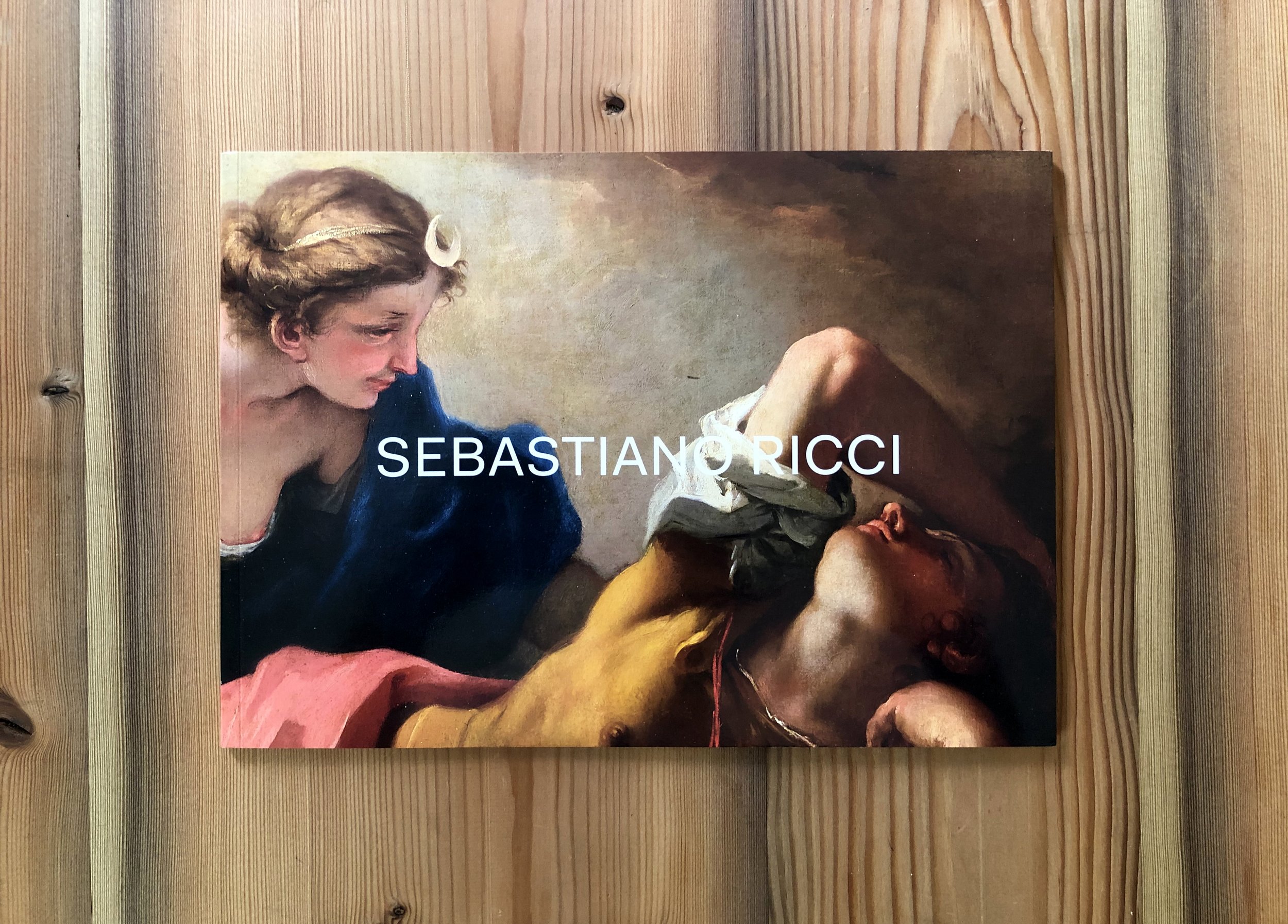
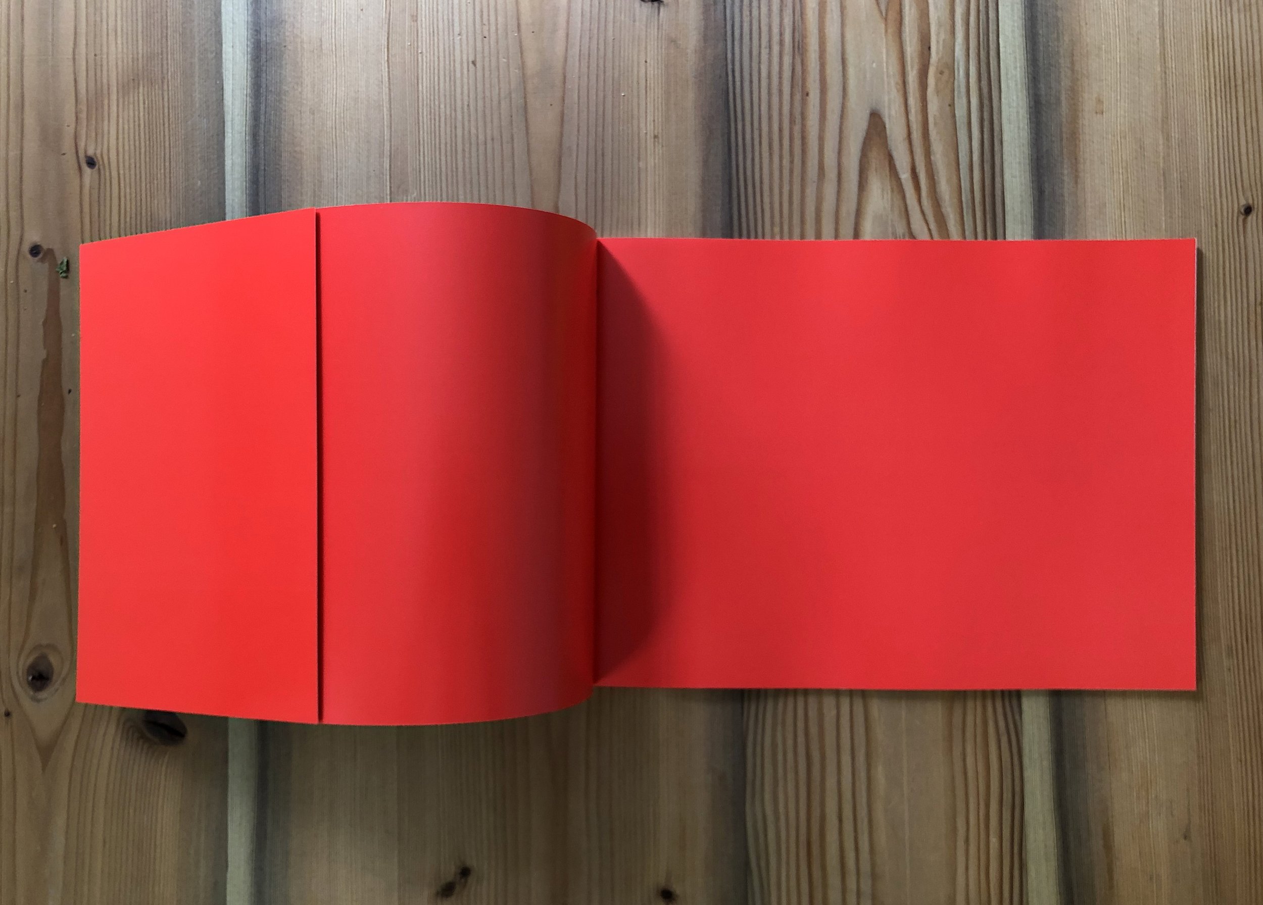
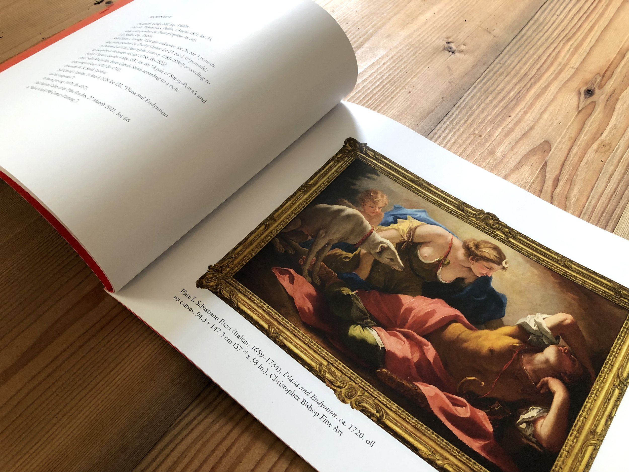
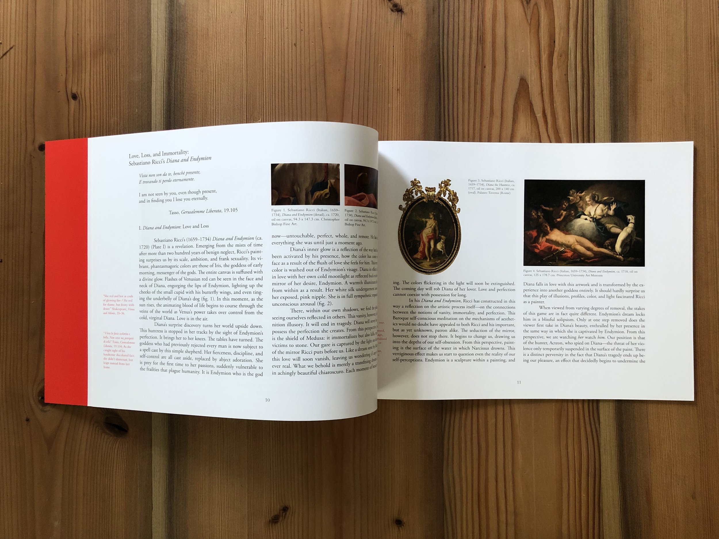
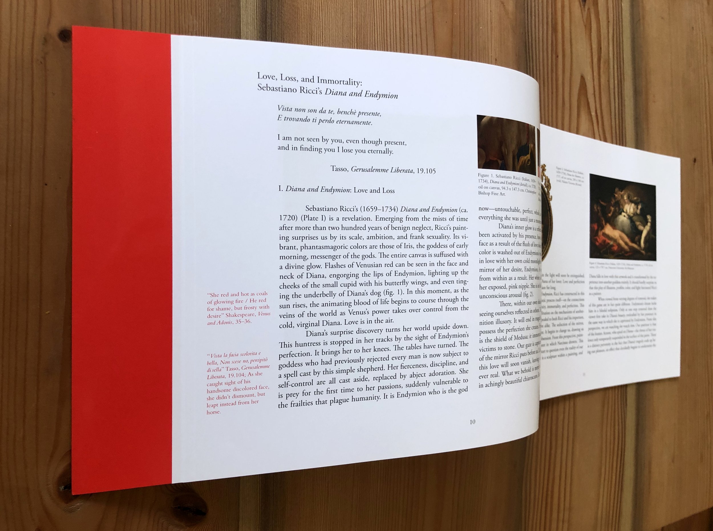
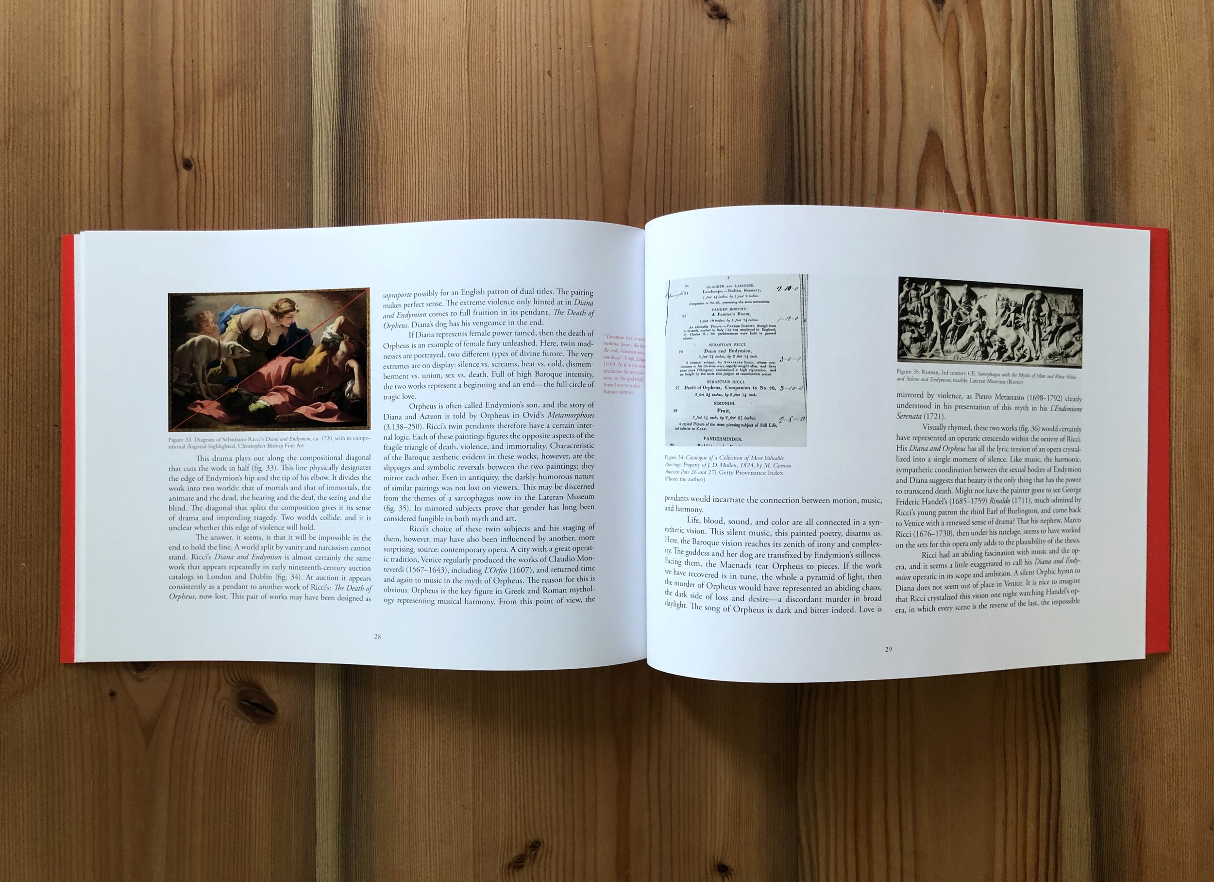
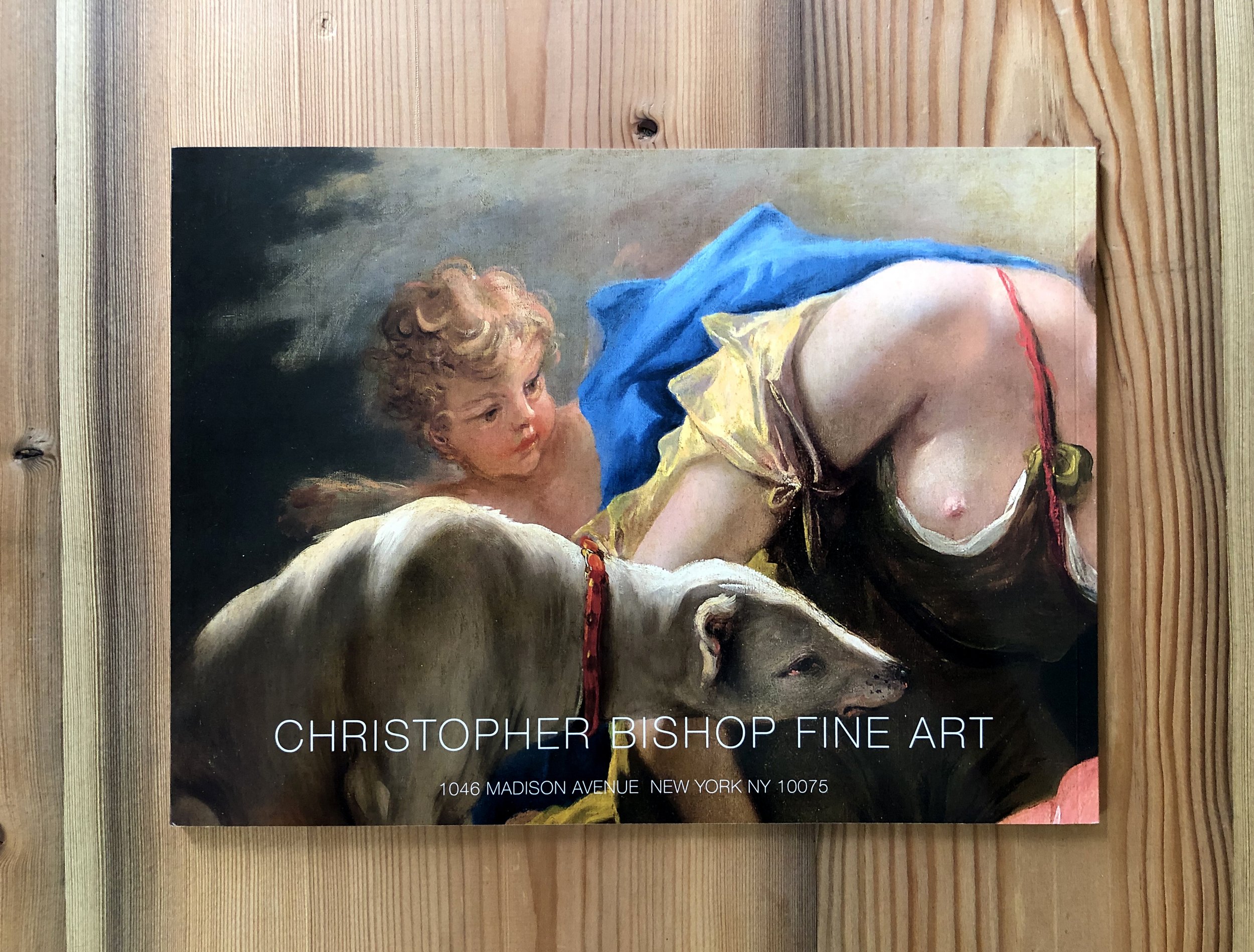
Sebastiano Ricci Catalog. CMYK plus spot color on cover and endpapers w/ added flap, thirty one pages. High gloss cover Dims: 8” x 11. Printed offset press by GHP in West Haven CT, 2022. Project designed for the presentation of Sebastiano Ricci’s painting Diana & Endymion (1720), exhibited at Tefaf in Mastricht, 2022. Twenty one page essay with thirty corresponding images. Fonts: Bembo, Fakt Pro Normal, Helvetica Neu Thin.
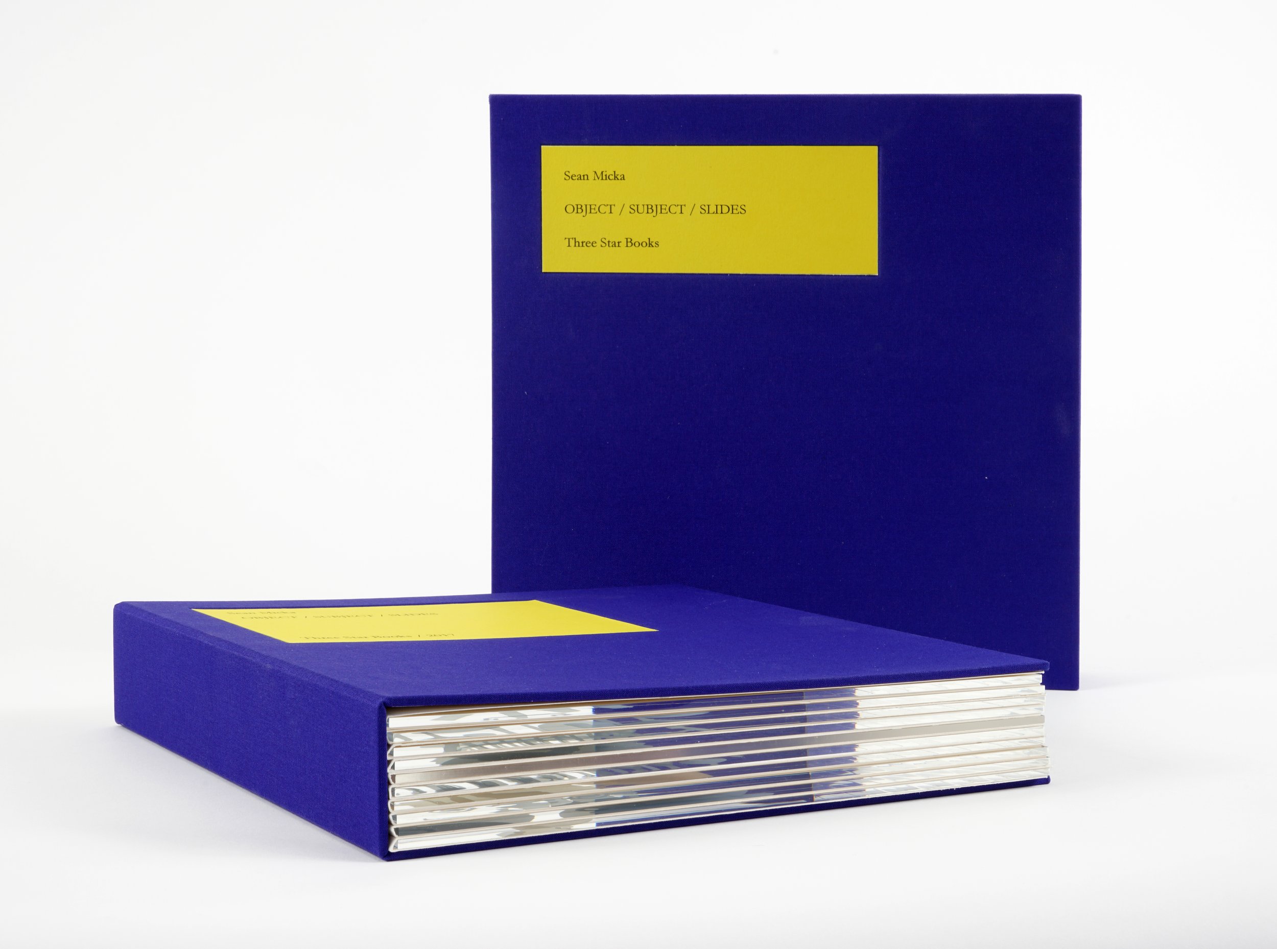
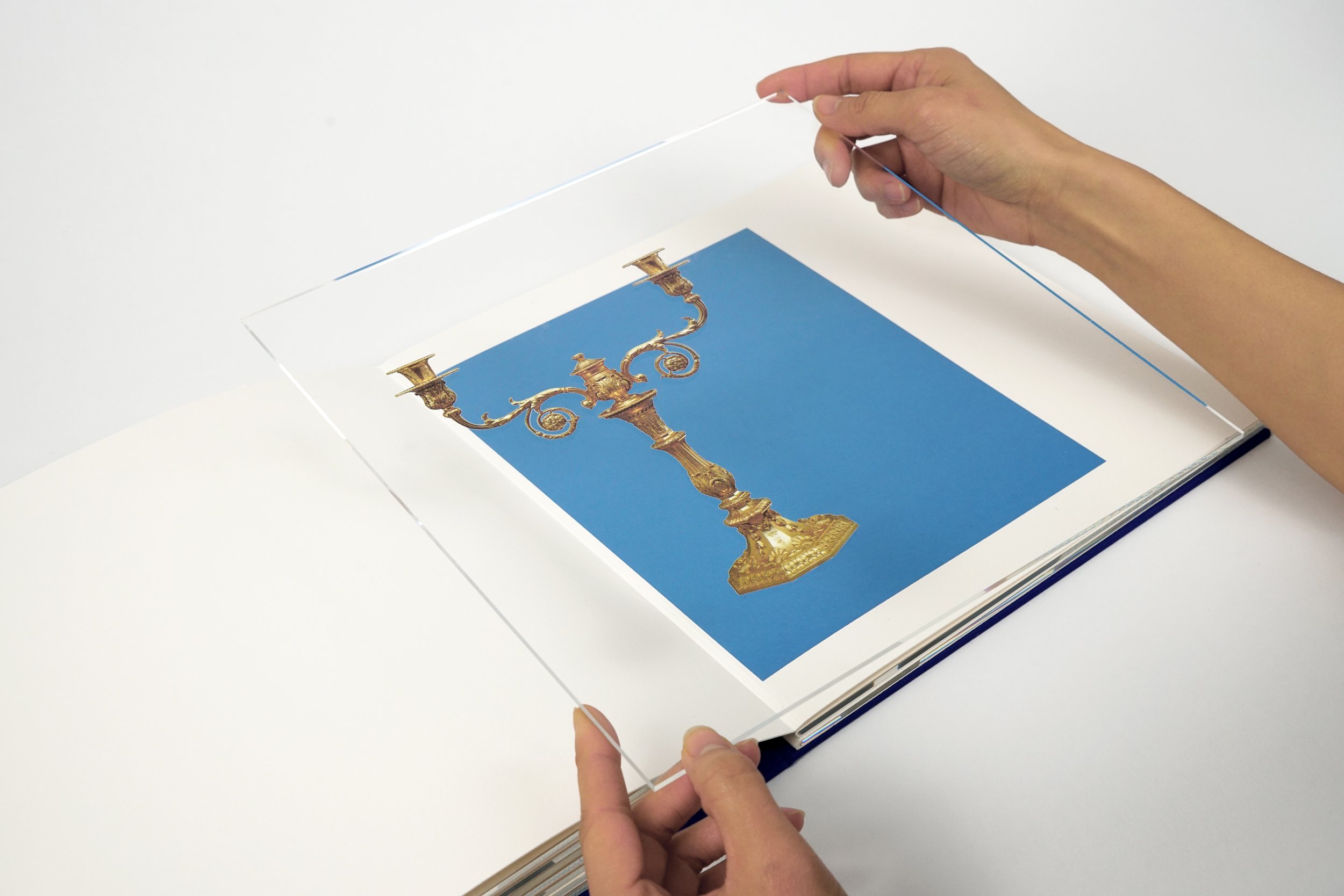
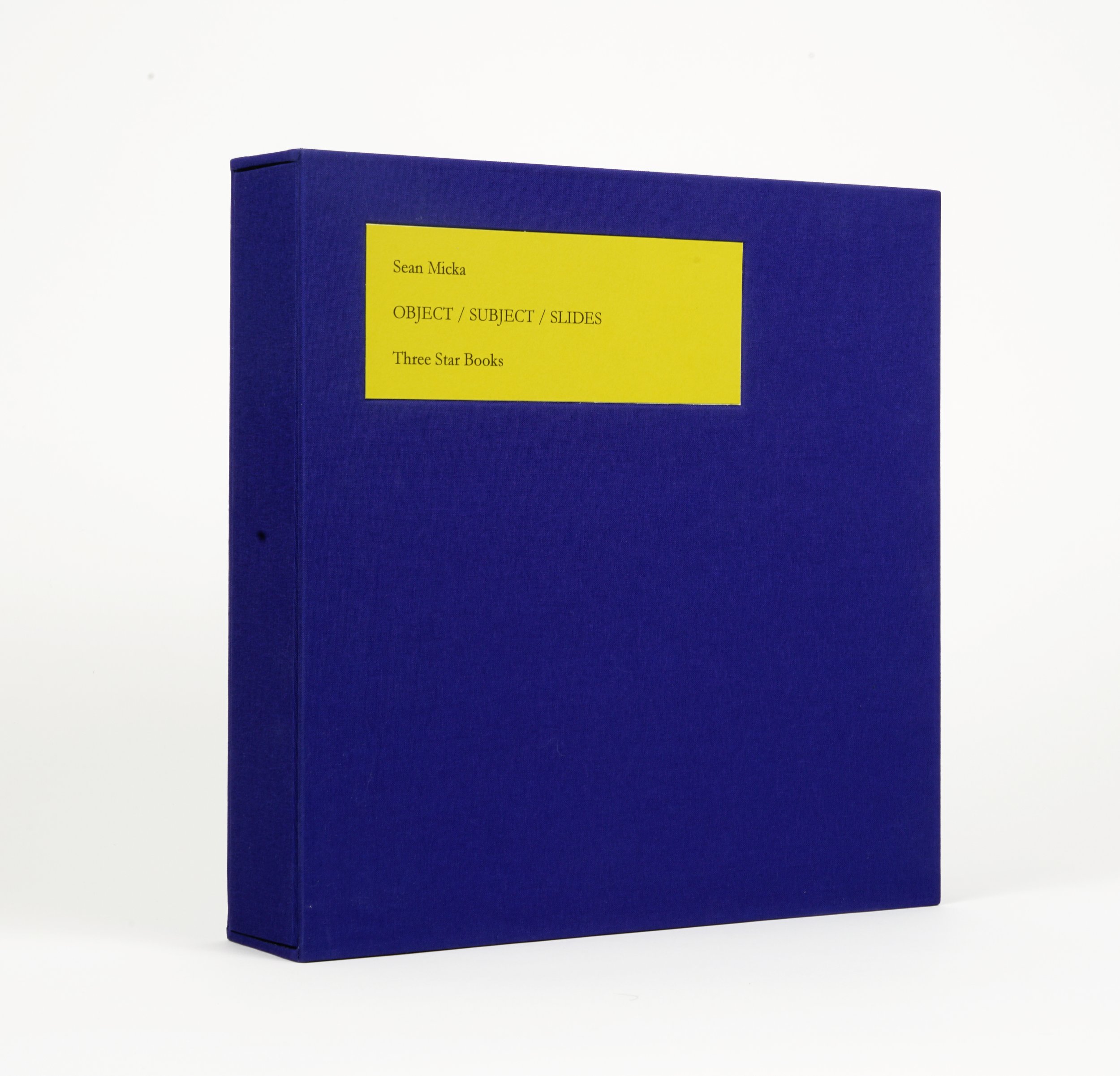
Mixed media and materials, edition of 20, 3 AP, published by Three Star Books, Paris, France, 2016. Ten individual folios containing ten unique UV prints on 3mm plexi-glass, housed in a clothbound box. * 11” x 11”x 2”. Signed and numbered. Font: Garamond This project was created as a way to imagine images as material objects and subjects, that are both flat and three dimensional, and serve as an archival memory of their past.
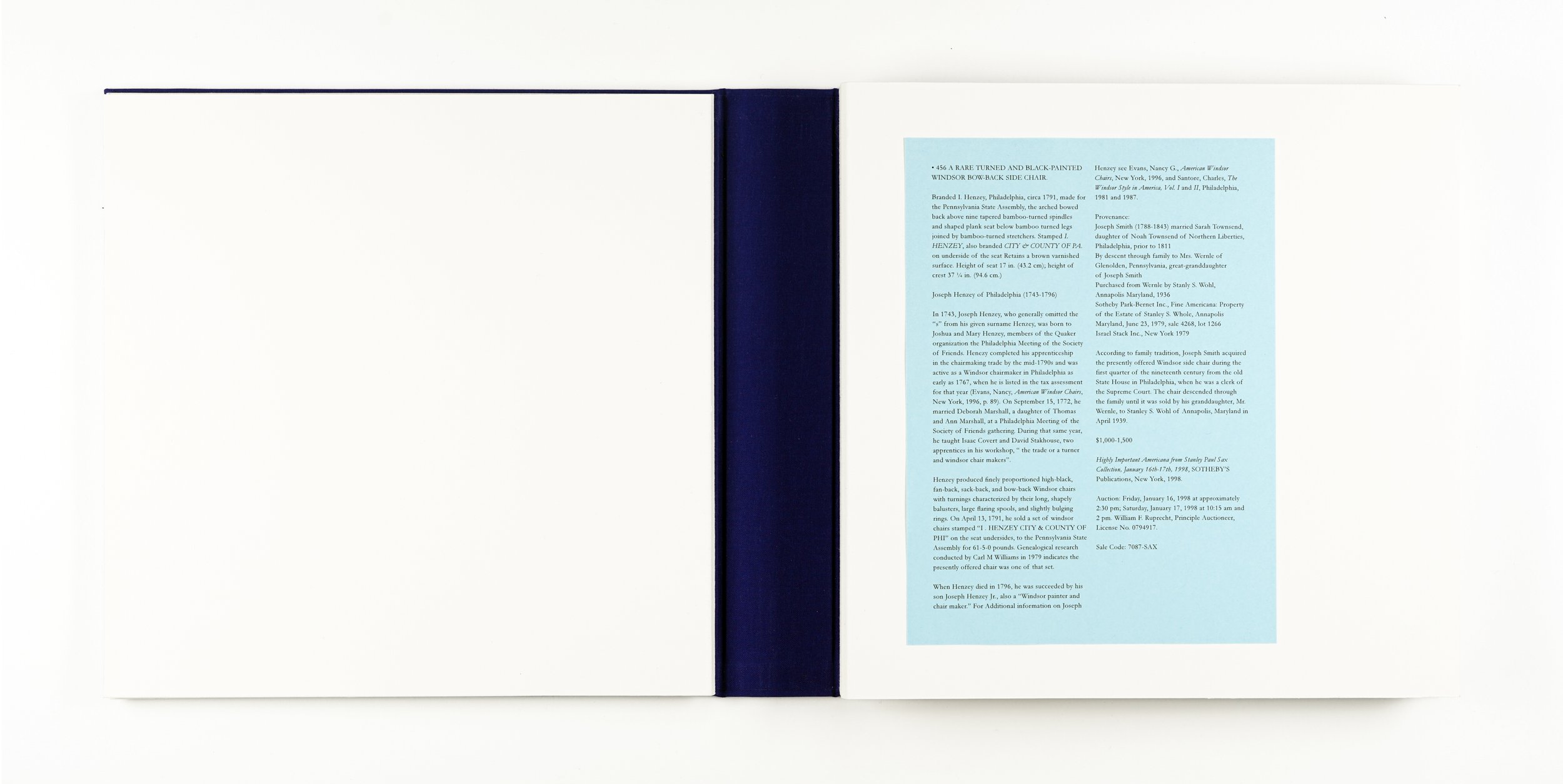
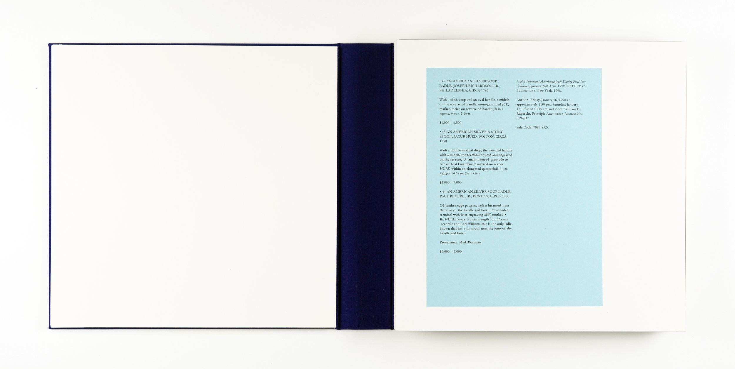
On the cover of each folder is a blue document that contains text that is taken from the catalog, including the object’s lot number, object and subject description, provenance, estimated vaule (in its currency system), date and location of sale, and the sales code name.
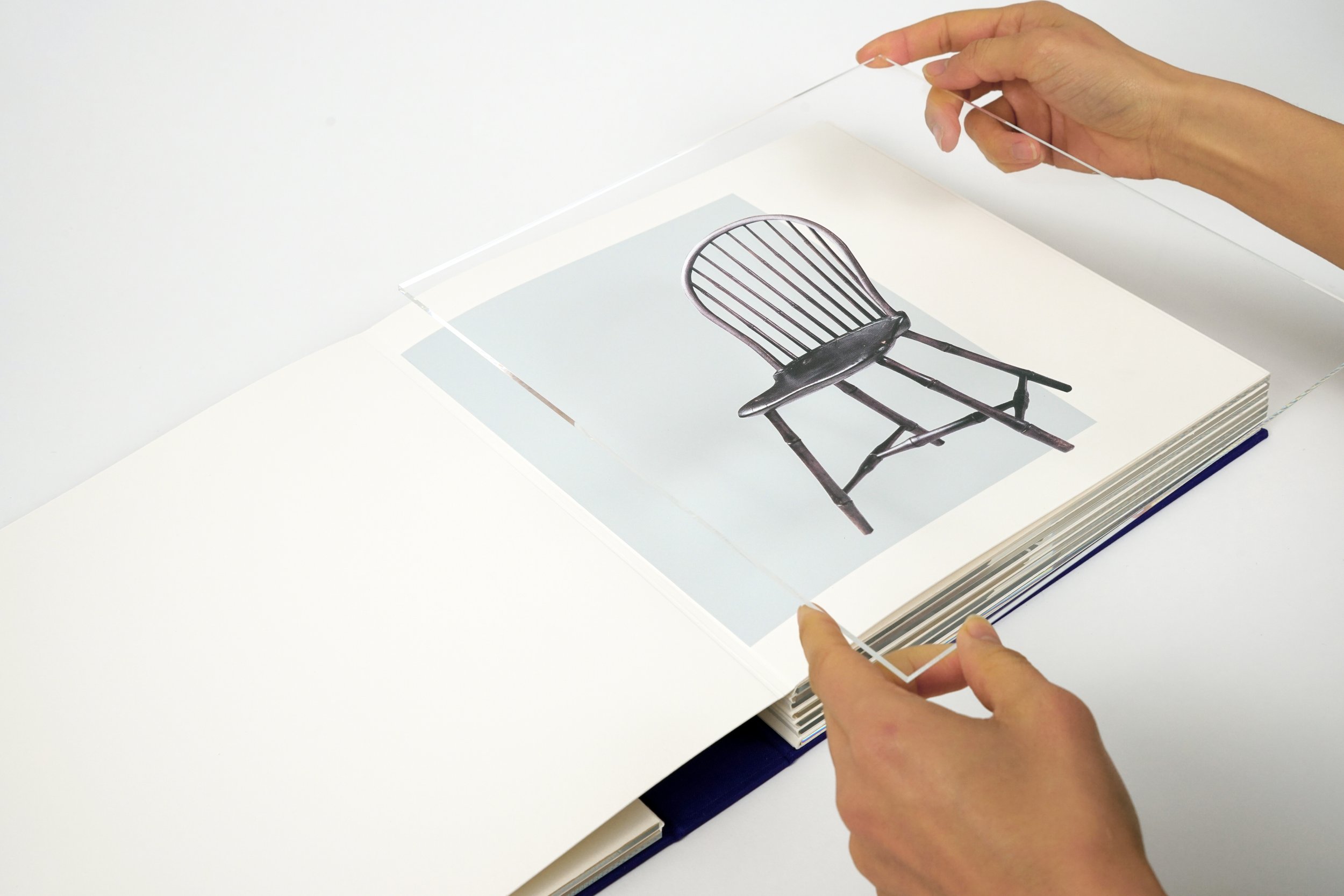
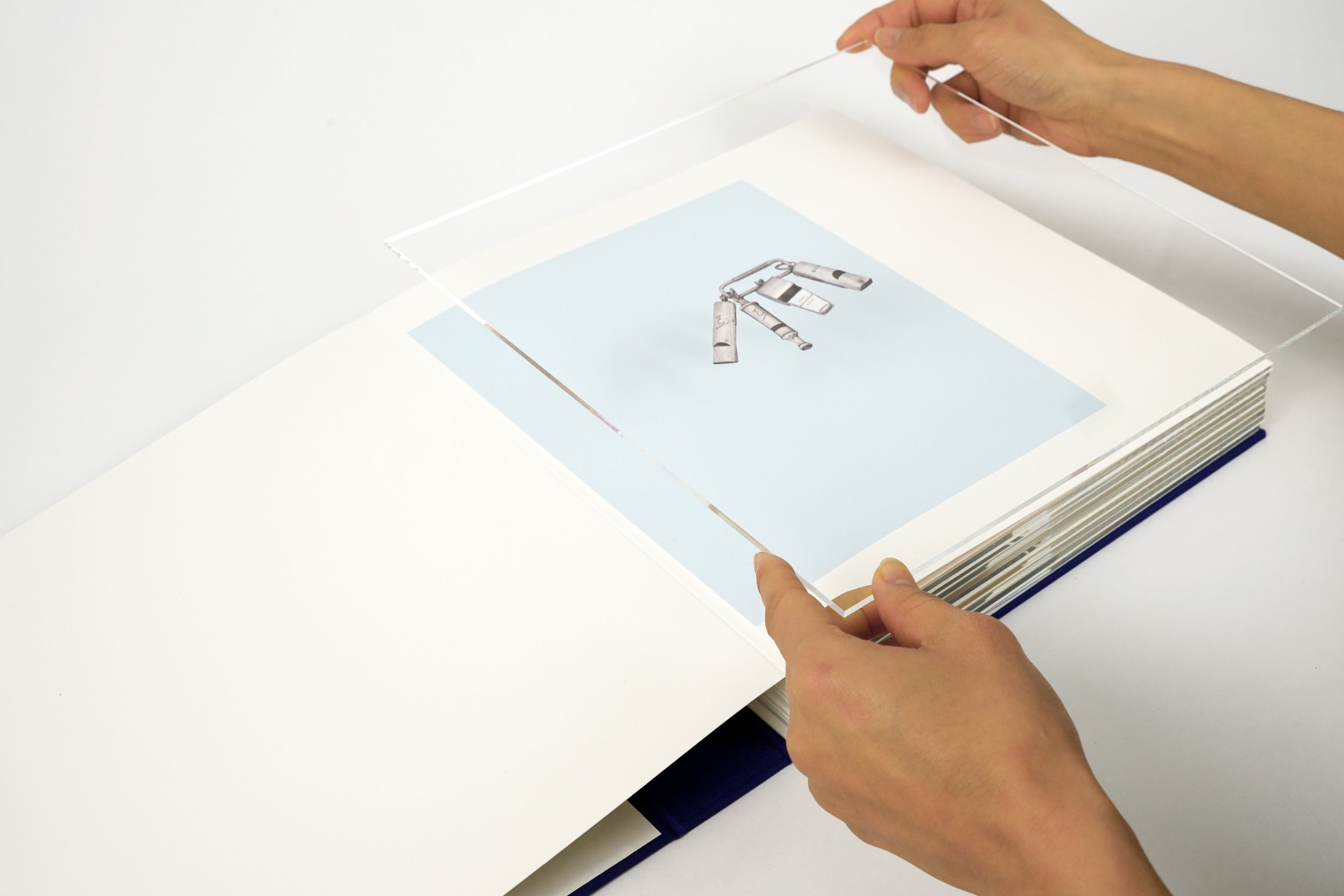
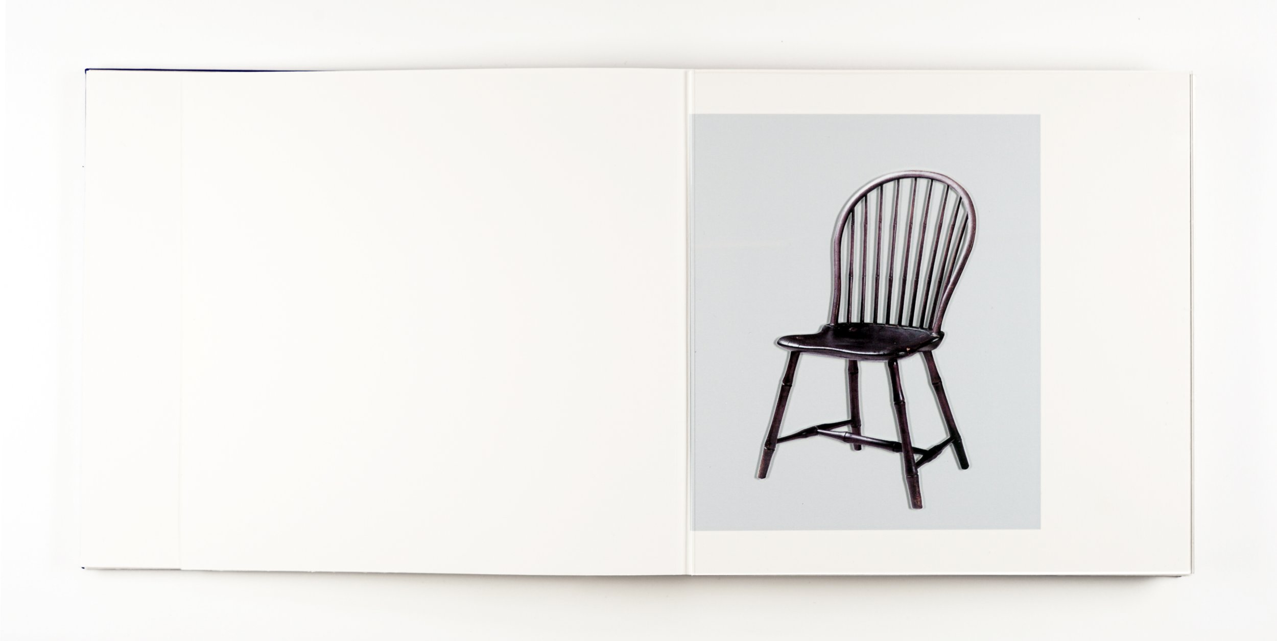
On the surface of the slides are UV printed images of objects found in luxury jewelry and antique auction catalogs. They are digital reproductions of photographic reproductions, originaly sourced from the catlog. In other words, they are laser-prints of four-color CMYK process prints.
Each slide sits atop a monochrome block of color that becomes the background of the object in the foreground/on the slide. This is intended to invite and encourage play with the work’s tacticle and optical qualities. The slide can be picked up, maniplulated and moved around
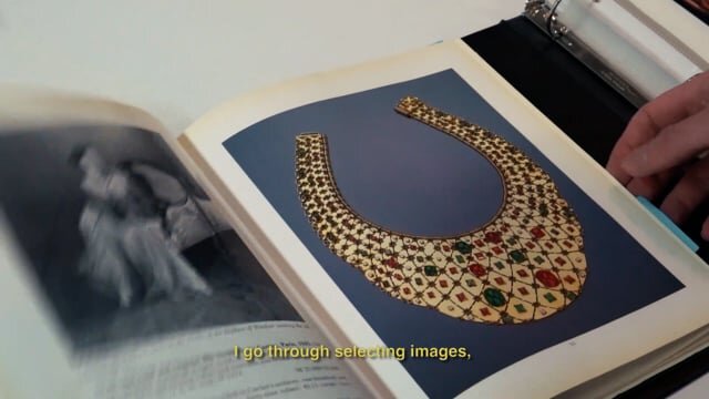
Sean Micka discusses Object/Subject/Slides for Three Star Books in his Brooklyn studio, Fall of 2021.
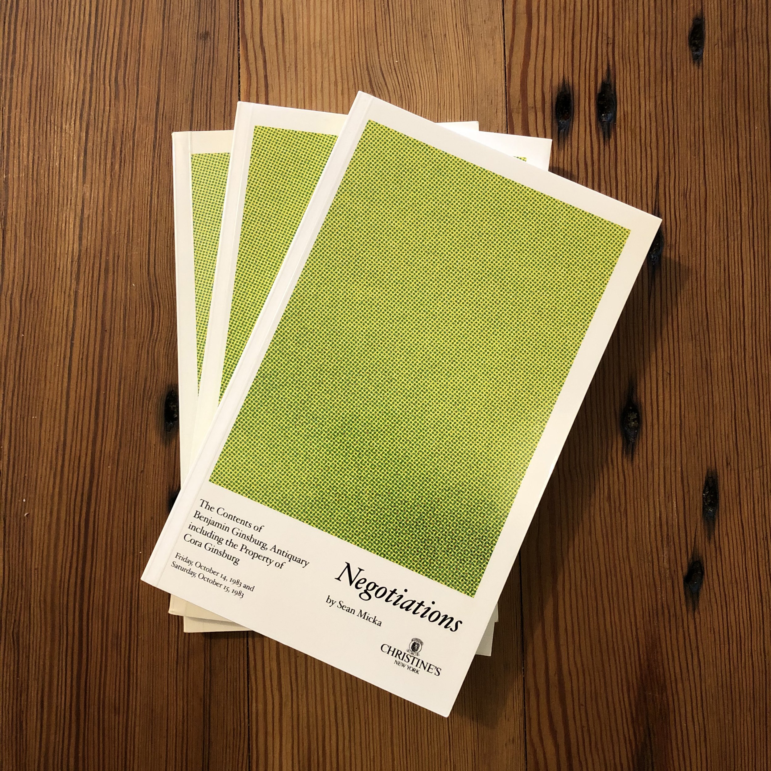
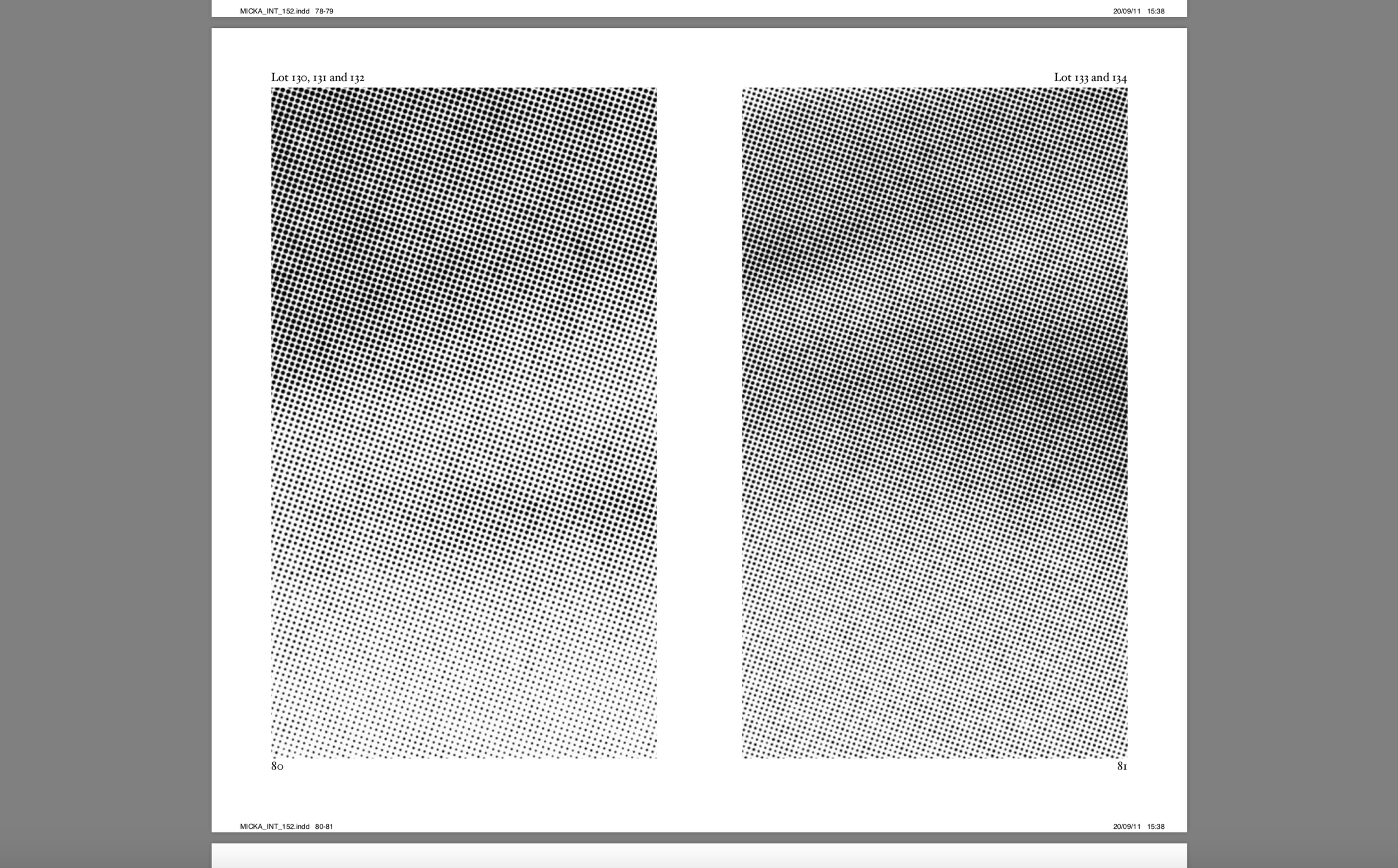
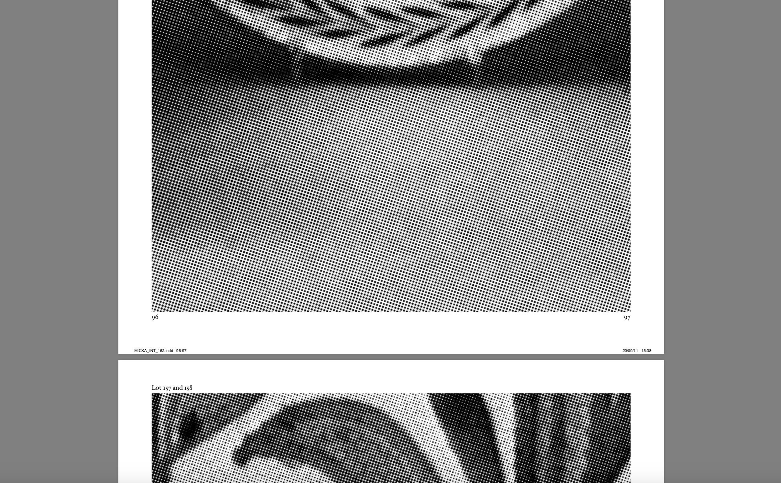
Negotiations Negotiations is a reimagined facsimile of an antiquarian auction catalog. All of its “Lot” photos were manigified to reveals the iamges halftone patterns –abstractions made from a representations. The idea was to invite the reader to speculate on questions of value, and meditate on the off-set printing technologies that make up pictures. Cover: Paperback, color, glossy finish. Binding: glue bound. Interior: black and white. 250 numbered copies. Published by Onestar books, Paris, France, 2011. 9” x 5.5”, 150 pages. Font: Hoefler Text.
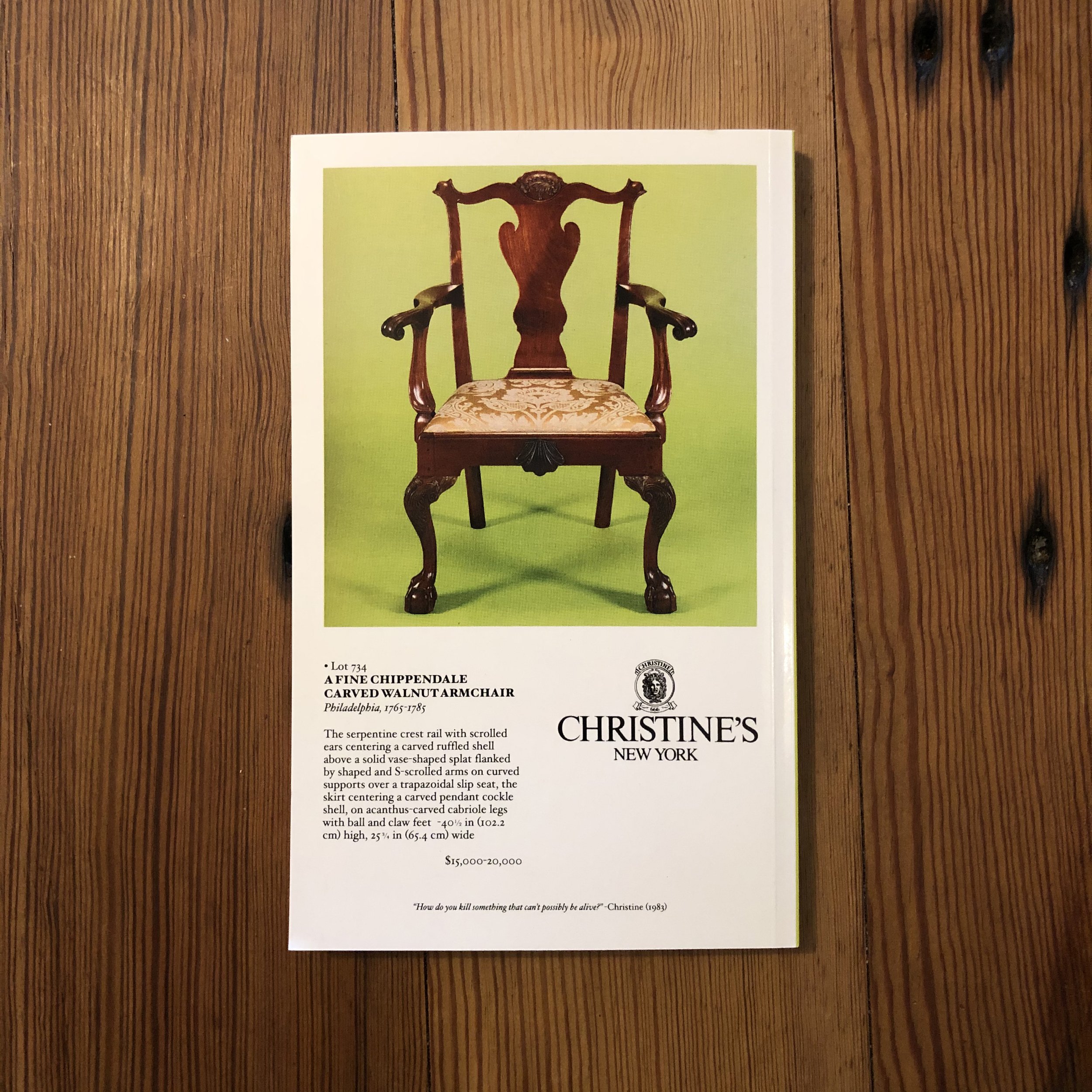
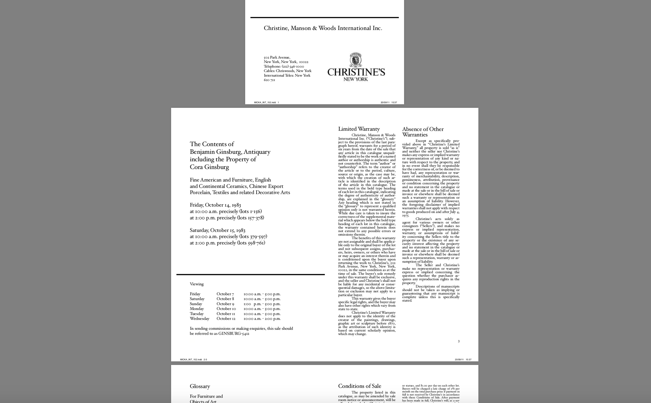
The book is broken up into three parts 1) a section of images and catalog descriptions 2) a glossary of terms and essay to better understand the terms in the feild of antiques and the arts and crafts movement, 3) and an image atlas that connects each halftone-pattern to their original photograph. Brand and logo was changed to the name “Christines”, with reimagined insigina using an graphic image of the head of medusa. The name “Chritines” is derived from the Stephen King novel of the same name.
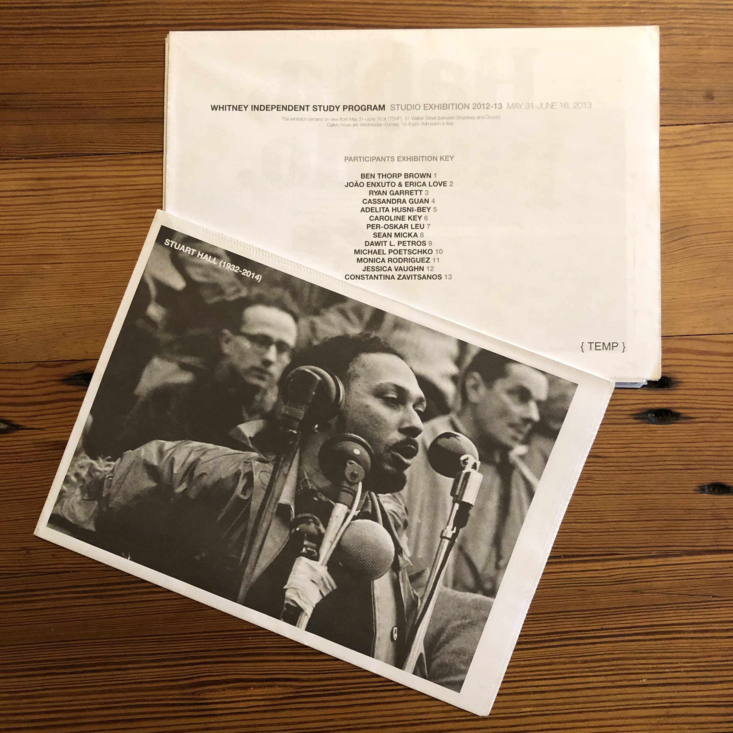
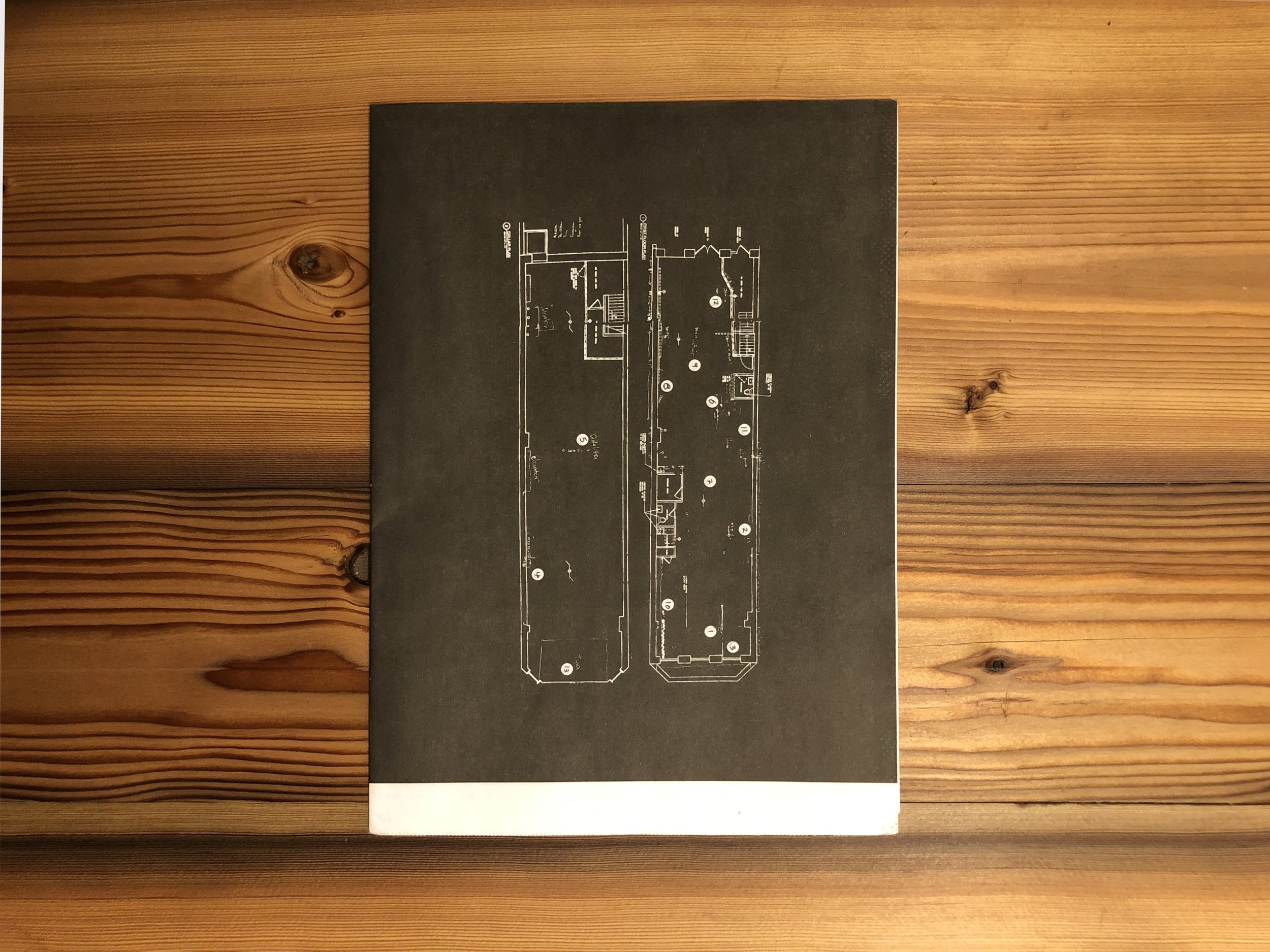
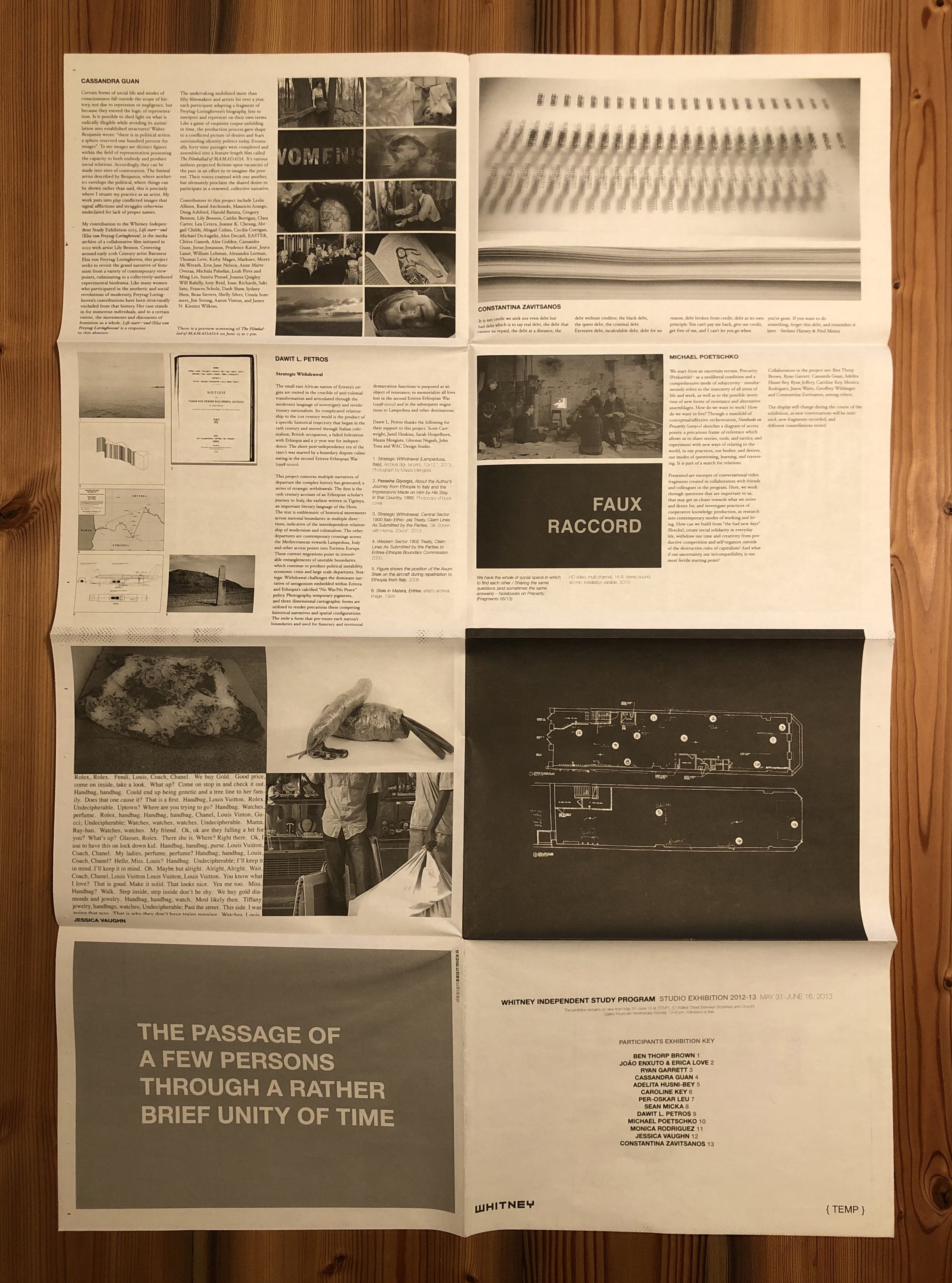
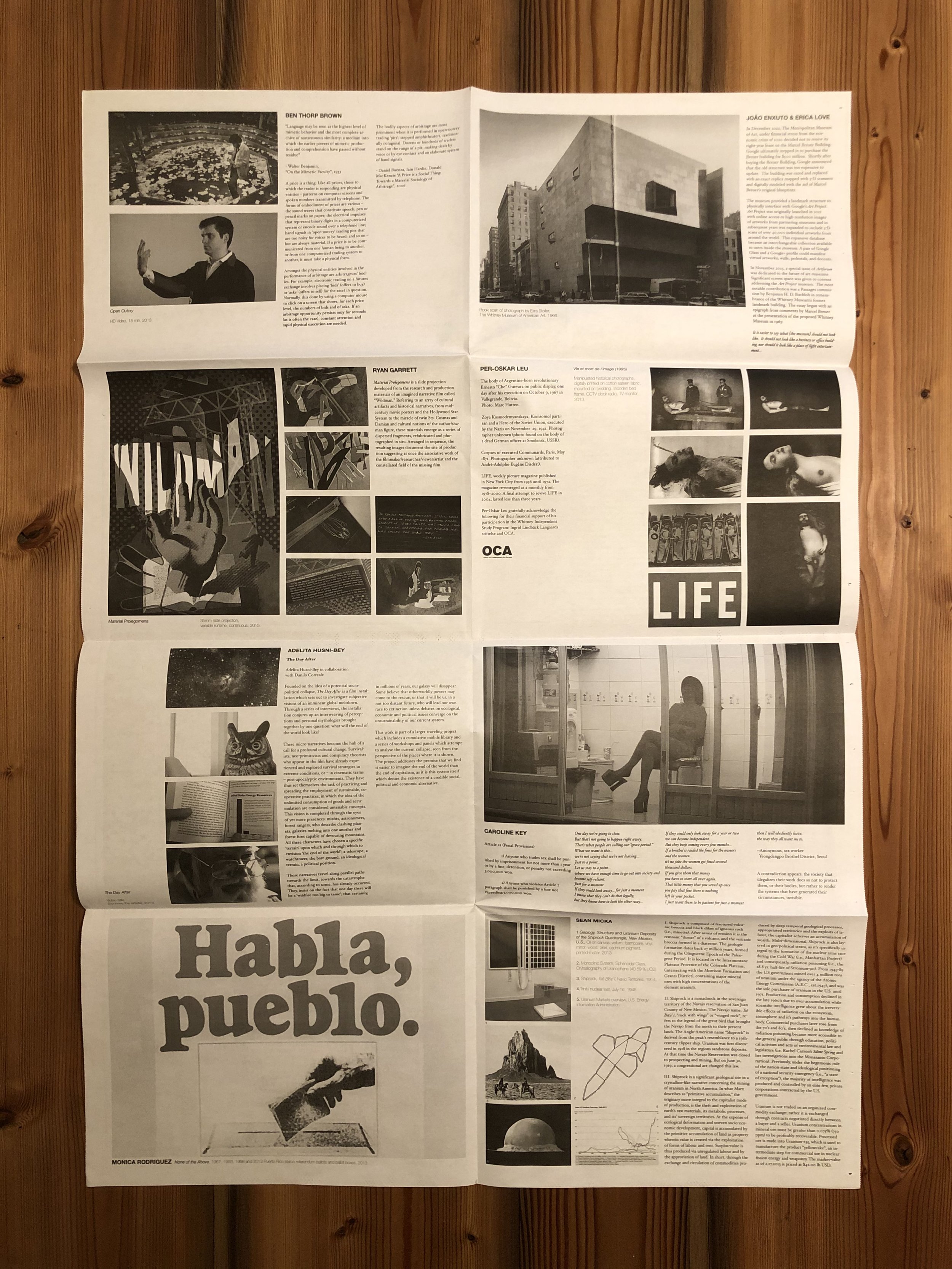
Exhibition Guide/Poster Whitney Independent Study Program Eight-panel fold out poster and exhibition guide. Black and white, newsprint, 32.16” x 22.75”, unfolded, 8.5” x 11.5” folded. Font: Garamond. Exhibition guide printed on behalf of the exhibitions for the Whitney Museum of American Art’s, Independent Study Program, Studio Program, from 2013-2015. Each rectangle was devoted to each artists project (and artists statement), connected to a map made from archtectual floorplans, used to locate each artists work in the space.
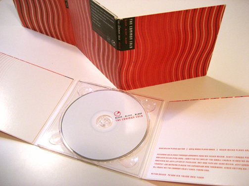
The Common Cold, Bleep….bleeep…..blooop, Action Driver Records, 2001. Typface: Squares.

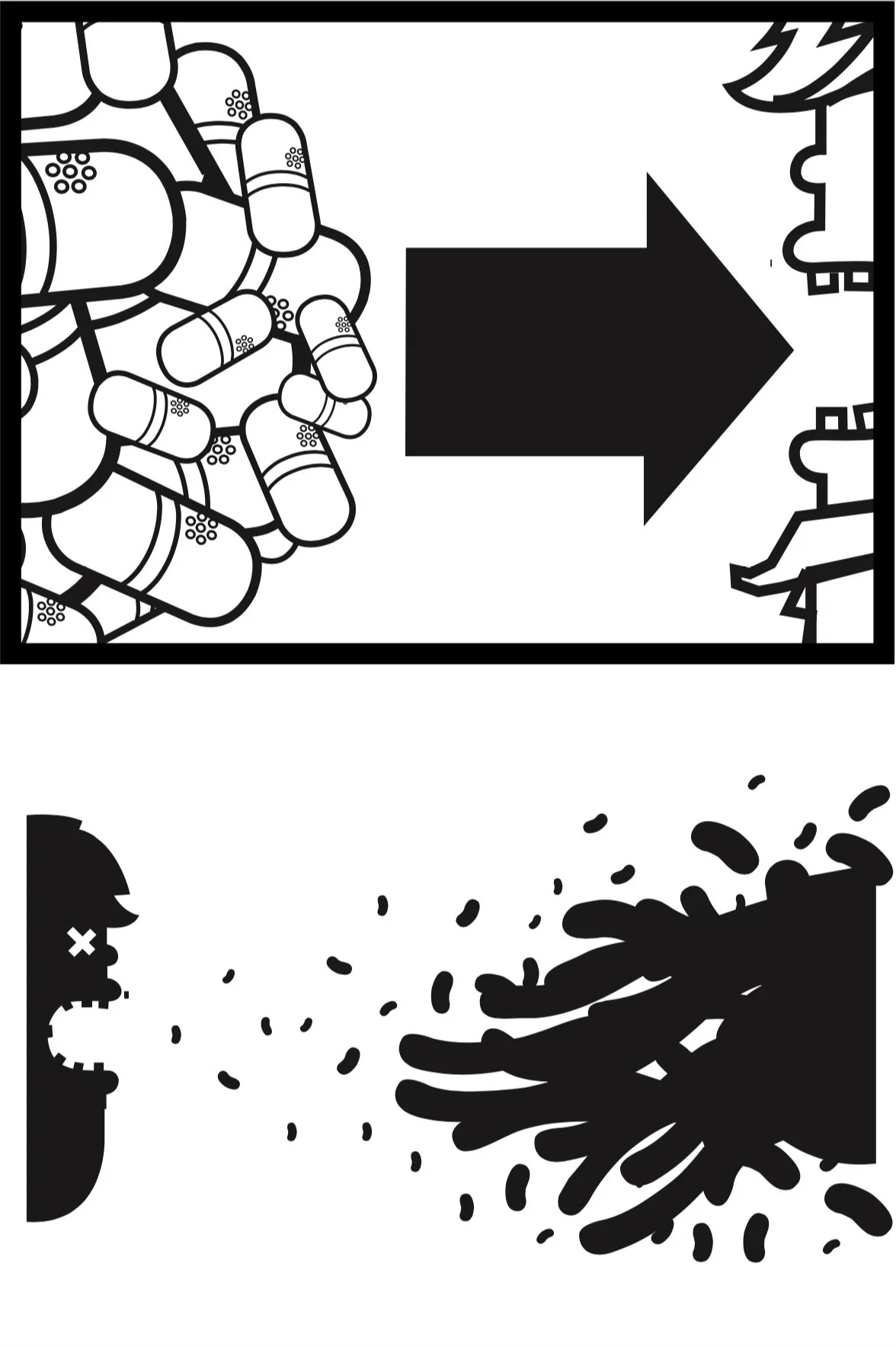
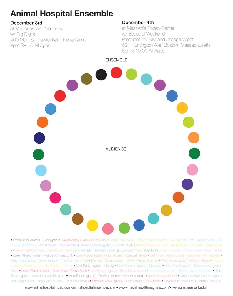


Exhibition Catalog, printed at GHP, West Haven CT. Digital Offset, Konica Minolta, AccurioJet KM-1, 2022. 52 pages. Typeface: Franklin Gothic. Client: Josee Steinberg & G, Litte Sky.
Sebastiano Ricci Catalog. CMYK plus spot color on cover and endpapers w/ added flap, thirty one pages. High gloss cover Dims: 8” x 11. Printed offset press by GHP in West Haven CT, 2022. Project designed for the presentation of Sebastiano Ricci’s painting Diana & Endymion (1720), exhibited at Tefaf in Mastricht, 2022. Twenty one page essay with thirty corresponding images. Fonts: Bembo, Fakt Pro Normal, Helvetica Neu Thin.
Mixed media and materials, edition of 20, 3 AP, published by Three Star Books, Paris, France, 2016. Ten individual folios containing ten unique UV prints on 3mm plexi-glass, housed in a clothbound box. * 11” x 11”x 2”. Signed and numbered. Font: Garamond This project was created as a way to imagine images as material objects and subjects, that are both flat and three dimensional, and serve as an archival memory of their past.
On the cover of each folder is a blue document that contains text that is taken from the catalog, including the object’s lot number, object and subject description, provenance, estimated vaule (in its currency system), date and location of sale, and the sales code name.
On the surface of the slides are UV printed images of objects found in luxury jewelry and antique auction catalogs. They are digital reproductions of photographic reproductions, originaly sourced from the catlog. In other words, they are laser-prints of four-color CMYK process prints.
Each slide sits atop a monochrome block of color that becomes the background of the object in the foreground/on the slide. This is intended to invite and encourage play with the work’s tacticle and optical qualities. The slide can be picked up, maniplulated and moved around
Sean Micka discusses Object/Subject/Slides for Three Star Books in his Brooklyn studio, Fall of 2021.
Negotiations Negotiations is a reimagined facsimile of an antiquarian auction catalog. All of its “Lot” photos were manigified to reveals the iamges halftone patterns –abstractions made from a representations. The idea was to invite the reader to speculate on questions of value, and meditate on the off-set printing technologies that make up pictures. Cover: Paperback, color, glossy finish. Binding: glue bound. Interior: black and white. 250 numbered copies. Published by Onestar books, Paris, France, 2011. 9” x 5.5”, 150 pages. Font: Hoefler Text.
The book is broken up into three parts 1) a section of images and catalog descriptions 2) a glossary of terms and essay to better understand the terms in the feild of antiques and the arts and crafts movement, 3) and an image atlas that connects each halftone-pattern to their original photograph. Brand and logo was changed to the name “Christines”, with reimagined insigina using an graphic image of the head of medusa. The name “Chritines” is derived from the Stephen King novel of the same name.
Exhibition Guide/Poster Whitney Independent Study Program Eight-panel fold out poster and exhibition guide. Black and white, newsprint, 32.16” x 22.75”, unfolded, 8.5” x 11.5” folded. Font: Garamond. Exhibition guide printed on behalf of the exhibitions for the Whitney Museum of American Art’s, Independent Study Program, Studio Program, from 2013-2015. Each rectangle was devoted to each artists project (and artists statement), connected to a map made from archtectual floorplans, used to locate each artists work in the space.
The Common Cold, Bleep….bleeep…..blooop, Action Driver Records, 2001. Typface: Squares.